Mid-Century Modern Decor Ideas: How to Get the Look Right
There is a version of mid-century modern that has been sold back to us so many times it has stopped meaning anything. Tapered legs stuck onto a chipboard cabinet. A velvet sofa in a colour nobody used in 1958. A sunburst clock hung above a grey sectional and called a nod to the era. The…
There is a version of mid-century modern that has been sold back to us so many times it has stopped meaning anything. Tapered legs stuck onto a chipboard cabinet. A velvet sofa in a colour nobody used in 1958. A sunburst clock hung above a grey sectional and called a nod to the era.
The real thing was tighter and stranger than that. It came out of a specific moment: postwar material shortages, new bent-plywood and moulded-fibreglass techniques, cheap suburban land, and a generation of designers who genuinely believed a good chair should cost what an ordinary person could pay. Everything about the look follows from those pressures. Furniture sits low and on legs because houses had low ceilings and small rooms that needed to breathe. Wood is thin and shaped because the technology suddenly allowed it. Colours came out of the paint and laminate chemistry of the time.
Understanding why the style looks the way it does is what separates a room that feels authentic from a room that feels like a furniture catalogue. What follows covers the palette, the furniture proportions and spacing, the lighting, the materials, and how to find pieces without paying collector prices.
What Mid-Century Modern Actually Means (and What It Doesn’t)
Mid-century modern describes design produced roughly between 1945 and 1969, defined by clean horizontal lines, raised furniture on tapered or splayed legs, organic curved forms, warm woods like teak and walnut, minimal ornament, and a strong connection between indoor and outdoor space. The name itself was coined retroactively in the 1980s, long after the work was done.
The roots are European. Bauhaus designers who left Germany in the 1930s brought functionalist thinking to American schools and studios. Scandinavian workshops were developing a parallel language of warm wood and human proportion. The American contribution was mass production: the idea that a well-designed chair should be manufactured by the thousand rather than commissioned by the wealthy.
The names worth knowing, because they shape what you should be looking for: Charles and Ray Eames for moulded plywood and fibreglass seating, Eero Saarinen for pedestal bases that eliminated what he called the slum of legs under tables, George Nelson for playful lighting and storage, Hans Wegner and Finn Juhl for Danish chairs built around the shape of a sitting body, Isamu Noguchi for sculptural tables and paper lanterns, George Nakashima for live-edge wood that kept the tree visible, Florence Knoll for the disciplined, rectilinear office aesthetic that quietly influenced everything else.
What mid-century modern is not: it is not minimalism. Original rooms had books, ceramics, plants, textiles and art in quantity. It is not grey. It is not Art Deco, which came two decades earlier and leaned on symmetry, luxury materials and geometric ornament. And it is not the cheap tapered-leg furniture that floods the market under the label, which copies the silhouette and abandons the construction.
What’s the difference between mid-century modern and Scandinavian design?
They overlap heavily and share ancestors, but they pull in different directions. Scandinavian design leans lighter: pale woods like ash, beech and birch, white or soft neutral walls, restrained colour, and an emphasis on light because winters are long and dark. Mid-century modern, particularly the American branch, runs warmer and bolder, with darker walnut and teak, saturated accent colours, and more willingness to be graphic.
Scandinavian rooms tend toward the calm and uncluttered. Mid-century rooms are happy to be busier, with pattern on textiles, abstract art, and a fair amount of collected object on open shelving. If you want a working shorthand: Scandinavian is cool and quiet, mid-century is warm and confident. A room that mixes both, which many do, usually ends up leaning on Danish modern, the point where the two traditions actually met.
The Colour Palette That Makes or Breaks the Look
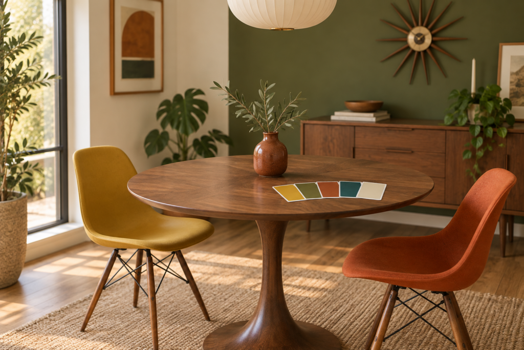
Mid-century palettes were built on warm earth tones as a base with one or two saturated accents on top. Think mustard, olive, teak brown, cream and rust as the working foundation, punctuated by turquoise, burnt orange, avocado or a deep mustard yellow. Cool grey and stark white were not part of the original vocabulary, and their presence is the fastest way to make a room read as modern-generic instead of mid-century.
Wall colour has more range than people expect. Original interiors used warm off-whites and creams heavily, which let the wood furniture and art carry the colour. But saturated walls were common too, particularly in dining rooms and dens: a deep olive, a warm ochre, a muted teal. If you want one reliable choice, a warm white with a yellow or ochre undertone sits beautifully against walnut and makes everything in front of it look more expensive than it is.
A feature wall genuinely belongs here, unlike in most styles where it looks dated. The era loved a single wall in bold colour, wood panelling, or a graphic wallpaper with an abstract or atomic repeat. Vertical or horizontal timber slat panelling in a warm-toned wood is a direct quotation of the period and does enormous work in a plain modern room.
Get the accents right by keeping them few and repeating them. Two accent colours, each appearing three or four times around the room, will hold the space together. A burnt orange cushion, a ceramic vessel in the same family, and a thread of it in the rug pattern reads as intentional. One orange cushion alone reads as an accident.
Pay attention to the wood tone as a colour in its own right. Teak is honey-brown with a slightly orange cast. Walnut is darker and cooler, closer to chocolate. Rosewood is dramatic and heavily figured. Mixing two of them in one room is authentic, since nobody in 1962 bought everything at once, but a room with four different wood tones and no repetition starts to look like a secondhand shop floor. Repeat each wood at least twice.
Choosing and Arranging the Furniture
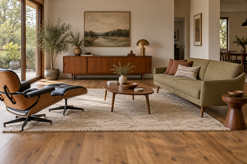
The proportions matter more than the pieces. Mid-century furniture is low, light on its feet, and pulled away from the walls, and getting those three things right will make an ordinary room feel correct even with modest furniture in it.
Seat heights of the era sat around 40 to 43cm (16 to 17 inches), noticeably lower than the chunky sofas sold today. Backs were lower too. The effect is a room where the eye travels over the furniture rather than being blocked by it, which is precisely why the style works in houses with 240cm ceilings. If you are buying new, check the seat height and the back height before anything else. A sofa with a 55cm back and skinny wooden legs is not mid-century, it is a normal sofa wearing a costume.
Legs are the giveaway. Real mid-century legs are either tapered and angled slightly outward, hairpin in bent steel, or part of a sculptural pedestal base. Crucially, the furniture is genuinely raised, with visible floor beneath it. That gap is doing the work: it makes heavy pieces look light and small rooms look larger.
Spacing follows a few reliable numbers:
- Leave 40 to 45cm (16 to 18 inches) between the sofa edge and the coffee table, enough to pass through without stepping over.
- Keep the coffee table height within a couple of centimetres of the sofa seat height. Low furniture needs a low table or the proportions collapse.
- In a living room, the rug should sit under at least the front legs of every seating piece, and ideally all four. A rug floating in the middle with furniture stranded around it is the single most common arrangement error.
- A dining pendant hangs roughly 75 to 90cm (30 to 35 inches) above the tabletop.
- Pull large furniture 10 to 20cm off the wall where the room allows. Mid-century rooms were designed to float furniture, not line it up against the perimeter.
The sideboard or credenza is the workhorse of the style and the one piece worth prioritising. A long, low teak or walnut cabinet gives you storage, a display surface at the right height, and a horizontal line that anchors a wall. Sideboards of the period ran roughly 70 to 80cm tall and often 150cm or more long. Under a wall-mounted television, behind a floating sofa, or along a hallway, it solves problems in nearly every room.
Beyond that, the recognisable seating archetypes are worth knowing by shape rather than by name: the moulded plywood lounge chair with a separate ottoman, the wire or fibreglass shell chair on a splayed or wire base, the Danish lounge chair with a wooden frame and a loose seat cushion, the tulip-style pedestal table, the low slatted bench, the nesting side tables.
How do you mix mid-century furniture with pieces you already own?
Use the mid-century pieces as the sculptural focus and let existing furniture become the quiet background. One good armchair, one credenza and one strong light fixture will define a room’s style far more forcefully than four mediocre reproductions.
The mixes that work reliably: mid-century with industrial, because steel and raw wood share the same honest-materials logic. Mid-century with bohemian, because rattan, woven textiles and macramé were genuinely part of the late-sixties version of the style. Mid-century with contemporary minimalism, where the warm wood softens an otherwise cold space. The mix that fights hardest is heavy traditional furniture, since carved, skirted, floor-sitting pieces are the visual opposite of raised and tapered.
If your existing sofa is too bulky, you can often fix it without replacing it. Swap chunky block feet for tapered wooden legs, replace the cushions with firmer, lower-profile ones, and add a slim walnut side table beside it. The eye reads the surrounding cues and forgives the sofa.
Lighting, Art and the Details That Sell the Era
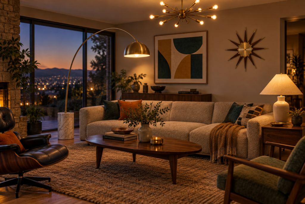
Lighting is where mid-century interiors become unmistakable, and it is the cheapest high-impact change in the whole style. The period treated light fixtures as sculpture rather than utility, which means a single good fixture can carry a plain room.
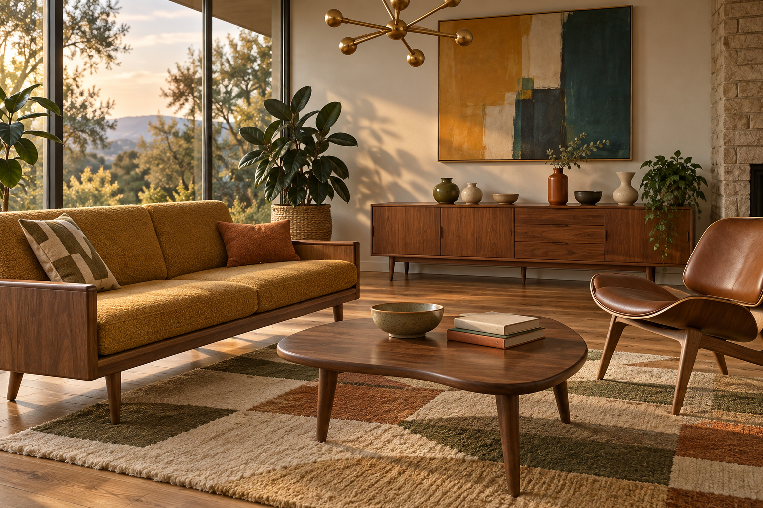
The recognisable forms are the sputnik or atomic chandelier with brass arms radiating from a central sphere, the arc floor lamp that reaches over a sofa from a heavy base, the bubble pendant in white translucent material over a wire frame, the tripod floor lamp with a conical shade, and the globe pendant. Brass, walnut and white enamel are the correct finishes. Brushed nickel and black iron read as later eras.
Layer at three heights as a matter of course: an overhead fixture, table lamps at roughly seated eye level, and a floor lamp or low source. Use warm bulbs throughout, somewhere around 2700K, and put as much as possible on dimmers. Cool white light makes warm wood look grey and flattens every texture in the room.
For art, abstraction is the era’s native language. Geometric compositions, hard-edge colour blocks, gestural abstracts, mid-century travel and exhibition posters with strong flat colour, and botanical or architectural line drawings all belong. Frames should be thin, in natural wood or black, and the mat generous. Hang single pieces with the centre at about 145cm (57 inches) from the floor, which matches average standing eye level, and treat a gallery wall as one unit centred at the same height.
The smaller details do disproportionate work. Studio pottery and ceramics with matte glazes in olive, oatmeal, rust and cream. Starburst clocks and atomic wall sculpture. Sculptural bowls and free-form glass in smoke, amber or turquoise. Slim brass hardware on cabinets. Barware, because the era genuinely revolved around it, with a decanter and a set of faceted glasses on a tray reading as period-correct rather than affected.
Plants are not optional decoration here. Mid-century architecture was obsessed with bringing the outdoors in, and the houseplants of the moment were specific: rubber plants, monstera, snake plants, philodendron, and fiddle leaf figs. Put them in simple ceramic planters or a tapered wooden plant stand with splayed legs, which is itself one of the most recognisable small pieces of the period.
Wood, Wool and the Materials That Give It Warmth
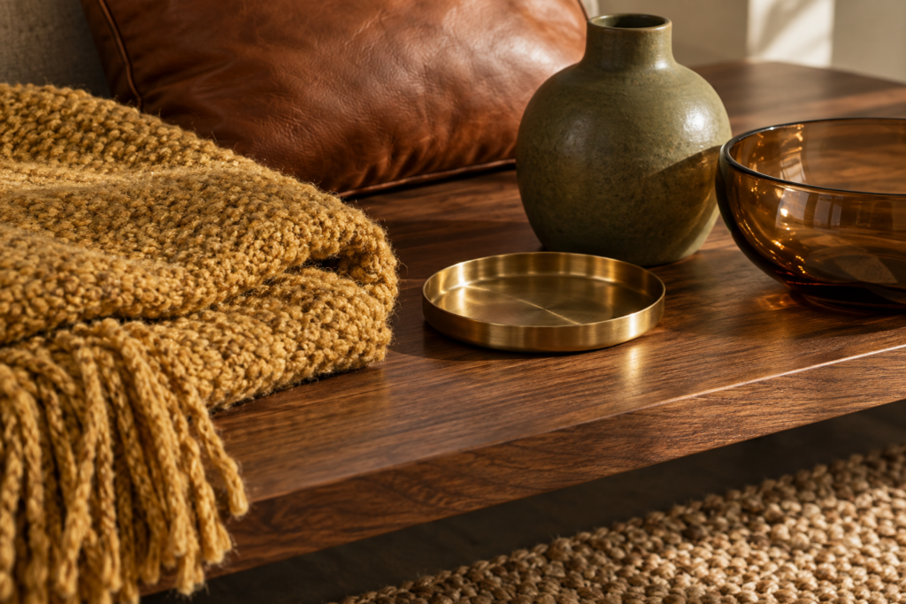
The material palette is what keeps a mid-century room from feeling austere, and it is narrower than most styles. Warm woods first, teak and walnut above all, with oak, rosewood and moulded plywood also correct. Then metal, specifically brass and chrome, used in slim amounts. Then glass, both clear and coloured. Then the textiles: wool, leather, boucle, and woven natural fibres.
Texture contrast is what makes the style photograph well and feel good in person. A smooth walnut surface beside a nubby wool cushion beside cool brass beside a woven jute rug gives a room depth without a single pattern being involved. Original interiors leaned on this constantly, because the forms themselves were simple enough to need it.
Leather deserves a specific note. Tan, cognac and dark brown leather that develops a patina is deeply period-correct, and a worn leather chair in an otherwise new room instantly adds the age the style depends on. Black leather works too, particularly on office-adjacent seating.
Rugs ran in two directions. Geometric and abstract patterns in the era’s palette, and flat plain wool in a warm solid colour. Shag rugs are authentic to the later sixties but are a stronger commitment than most people expect. Sisal and jute are a safe, quiet base that lets furniture be the event.
Patterns of the period are worth recognising when you’re shopping: atomic and starburst motifs, boomerang shapes, abstract organic blobs, and geometric repeats in olive, mustard, orange and teal. Large-scale bold prints on curtains and upholstery were normal. One patterned element per room is usually enough, with the rest of the textiles solid and textural.
Avoid the material tells that immediately break the illusion: high-gloss white lacquer surfaces, heavy tufting and button-back upholstery, ornate carving, brushed chrome in large quantities, and thin veneered particle board with printed woodgrain. That last one is what most budget mid-century furniture actually is, and it announces itself within a year as the edges chip.
Sourcing the Real Thing Without Overpaying
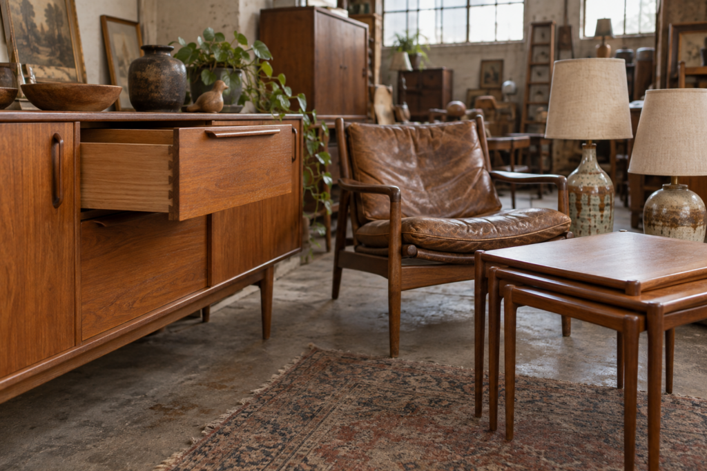
Original mid-century furniture is still findable at reasonable money if you look where the competition is thinnest, and secondhand solid wood at a fair price will outlast new veneered furniture by decades.
Estate sales are the best source, particularly clearances of houses that have not changed hands since the sixties or seventies. Whole households appear at once, and the teak sideboard nobody photographed well in the listing often goes for a fraction of dealer prices. Regional auction houses are the second strongest, because mixed lots of mid-century ceramics, lamps and small tables frequently sell below what a new equivalent costs.
Local classified listings and marketplace apps reward searching by the words sellers actually use rather than the words dealers use. Search for teak, Danish, retro, sideboard, credenza, vintage and the era’s manufacturer names, and search misspellings too. Charity shops and house clearance warehouses turn over stock constantly, so frequency beats strategy. Architectural salvage yards are where slat panelling, old doors and period lighting surface.
When you are looking at a piece in person, the checks that matter are quick. Look at the joinery, since dovetailed drawers and mortise joints indicate solid construction while staples and glued butt joints do not. Check whether the wood is solid or veneered by examining the edges and the underside, and remember that veneer over solid core is period-correct and fine, while veneer over particle board is not. Check that legs are original and not later additions, since retrofitted tapered legs are common. Look for maker’s marks stamped or branded underneath drawers and on the back panel.
Condition problems fall into two categories. Surface issues, including dry wood, water rings, light scratches and tired upholstery, are all straightforwardly fixable and are your best negotiating leverage. Structural issues, including wobbling joints, warped panels, delaminating veneer and active woodworm, are expensive and often not worth the effort unless the piece is genuinely special.
Restoration is simpler than it sounds for most teak and walnut. Clean thoroughly, sand lightly along the grain only if needed, then feed the wood with teak oil or a good furniture oil, applying thin coats and wiping away the excess. A dull, grey-looking piece usually transforms after two applications. Reupholstery costs more than people expect, so factor it in before you buy a chair that needs it, and price the fabric separately since that is where the budget actually goes.
Are reproductions worth buying instead of originals?
It depends on which piece and which reproduction. Licensed reproductions made by the original manufacturers are built to the designer’s specification and often cost more than a comparable original, but they arrive in new condition with a warranty. Unlicensed copies vary enormously, and the difference is almost always in construction rather than shape: thinner material, cheaper foam, veneer over particle board, and joints that loosen.
A reasonable approach is to buy vintage for the pieces where age is an asset, meaning wood storage, tables and leather seating, all of which look better worn. Buy new for the things where age is a liability, meaning sofas, mattresses and anything with foam, which degrades. And spend real money on the one or two sculptural pieces you will look at every day rather than spreading a budget thinly across a full room of mediocre copies.
Does mid-century modern work in a small apartment?
It works better in small spaces than almost any other style, because it was designed for them. Postwar houses and apartments were compact, and the whole visual language of raised, low, light furniture exists to make modest rooms feel open.
The specific advantages: furniture on legs shows floor, and visible floor reads as space. Low backs keep sightlines open across a room. Nesting tables and the era’s wall-mounted shelving systems give you flexibility without bulk. Pedestal tables remove the leg clutter that makes small dining areas feel crowded. And the style’s tolerance for a single bold feature, one strong light fixture or one saturated wall, means a small room can have real character without being filled.
The mistakes to avoid in a small space are buying a reproduction sofa that is deeper and taller than the original proportions, pushing everything against the walls, and using too many different wood tones in a room the eye takes in all at once.
Frequently Asked Questions
Is mid-century modern still in style?
Mid-century modern has held popularity for over two decades now, which is long enough that it functions as a classic rather than a trend. The reason is practical: the furniture is well-proportioned, comfortable, and built from materials that age well, and the raised, low silhouettes suit the ceiling heights and room sizes of most housing stock. The saturated-colour and heavy-pattern versions move in and out of fashion, but the core furniture language has stayed steady.
What colours should I avoid in a mid-century modern room?
Cool greys and stark blue-toned whites are the main ones, since they drain the warmth out of teak and walnut and push a room toward generic contemporary. Also be careful with pastels, which belong to a slightly different retro register, and with cool-toned purples and magentas that were not part of the period palette. If a colour has a grey or blue undertone, test it against your actual wood furniture in daylight before committing.
What flooring suits mid-century modern best?
Warm-toned hardwood in oak, walnut or a mid-brown stain is the natural fit, ideally in wide planks with a matte or satin finish rather than high gloss. Cork and terrazzo are both authentic to the period and increasingly available again. Polished concrete works in open-plan spaces. Avoid grey-washed and very pale white-washed timber, which fights the warm palette that the rest of the style depends on.
How do I make a mid-century modern room feel warm rather than cold and sparse?
Add texture and evidence of life. The rooms that feel cold are usually the ones with too few soft materials: a wool throw, a boucle cushion, a jute or wool rug and lined curtains will change the feel of a space more than any furniture swap. Beyond that, fill the surfaces. Original interiors had books, ceramics, plants and art in quantity. Warm lighting at three heights does the rest.
Can I do mid-century modern on a small budget?
Yes, because the style rewards secondhand shopping more than most. Paint, lighting and a single good vintage credenza will establish the look for a fraction of a room’s worth of new furniture. Buy the sculptural pieces secondhand, keep neutral furniture you already own, and put money into a good light fixture and a decent rug rather than spreading it across many cheap items.
How do I tell if a piece is genuine vintage or a modern copy?
Turn it over and look underneath. Genuine pieces usually carry a stamped, branded or paper maker’s label on the underside of a drawer, the back panel or the underside of a seat. Check the drawer construction for dovetails, look at the edges to see whether the wood is solid or veneered over a solid core, and look for the uneven patina, small dings and slightly oxidised finish that come with decades of use. Perfectly even colour, machine-identical edges and modern screw types usually indicate a recent piece.
What’s the easiest room to start with?
A living room or dining room, because both are dominated by a small number of large decisions. In a living room, a credenza, a good light fixture and a correctly sized rug will define the whole space. In a dining room, a pedestal table with a set of shell or Danish-style chairs and a pendant hung at the right height does nearly all the work at once. Bedrooms and home offices are easy follow-ups, since the style’s storage pieces and desks adapt directly.