Trending Home Decor Colors: Sage Green, Burnt Orange, and Bold Palettes That Work
For a long stretch, it seemed almost every home was painted some version of cool gray with white trim. It was safe, it sold houses, and after a while it made a lot of rooms feel like waiting areas. Walk into a freshly decorated home now and you’re far more likely to find soft green…
For a long stretch, it seemed almost every home was painted some version of cool gray with white trim. It was safe, it sold houses, and after a while it made a lot of rooms feel like waiting areas. Walk into a freshly decorated home now and you’re far more likely to find soft green walls, a rust-colored sofa, a cabinet painted the shade of wet clay, or a dining room wrapped entirely in deep, moody red.
The shift toward warmer, earthier, and bolder colors isn’t just a passing look. It reflects how people want their homes to feel: comforting, personal, and connected to the natural world. Sage green and burnt orange sit right at the center of that change, surrounded by a wider family of rich shades that are finally being used with confidence.
Color is also where good intentions go wrong most often. A green that looked calm on a small card can turn gray and flat on the wall, and an orange accent can take over a room if it’s used in the wrong amount. What follows explains why these colors are trending, how to use sage green and burnt orange well, which other bold palettes deserve attention, how to choose and test a color in your own light, and how to bring bold shades home without committing to something you’ll want to repaint in a year.
Why Home Decor Colors Are Getting Warmer and Bolder
Home decor colors have moved toward warm, earthy, and nature-inspired shades because people want homes that feel restful and personal rather than neutral and anonymous. Greens, clay tones, rusts, and deep browns echo natural materials, pair easily with wood and linen, and feel comforting in both bright and dim light.
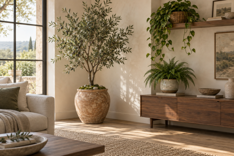
Several threads come together here. The first is the broader move toward natural materials in interiors. Oak, walnut, rattan, jute, stone, terracotta, and linen have all grown in popularity, and they look noticeably better beside warm and earthy colors than beside cool gray. A walnut sideboard against a sage wall feels harmonious in a way it never quite did against a cold silver-gray.
The second is time spent at home. As homes became offices, classrooms, and places to unwind all at once, many people wanted rooms that felt calming and cocooning. Soft greens, warm neutrals, and muted clay shades deliver that without the starkness of bright white or the gloom of flat gray.
Third, there’s a clear appetite for personality. Decorating feeds full of all-white rooms have been joined by homes with color-drenched studies, patterned wallpaper, painted ceilings, and vintage furniture in bold hues. People are more willing to use strong color, especially in smaller rooms where it has the biggest effect.
Warm neutrals versus bold colors
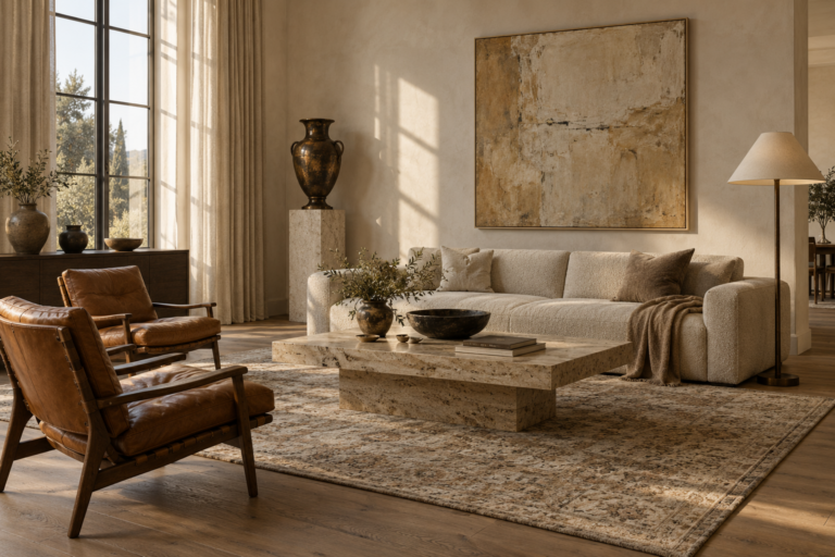
It helps to separate two parts of the trend. Warm neutrals, like cream, mushroom, sand, greige, and soft putty, are replacing cool grays as backdrop colors on walls and large surfaces. Bold colors, like burnt orange, deep green, oxblood, and ochre, are appearing as accents, on cabinetry, on single statement walls, and in small rooms painted top to bottom. Sage green sits somewhere in between, soft enough to act as a neutral yet distinctive enough to give a room character.
Understanding which role a color plays in a room is the key to using any trending shade well.
Sage Green: The Calm Color That Works Almost Everywhere
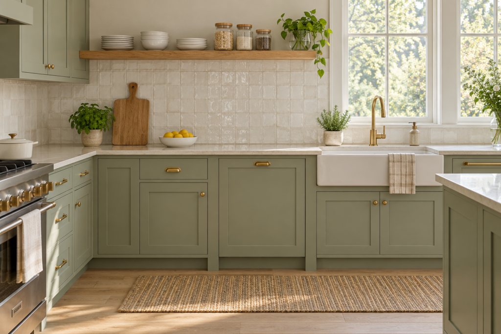
Sage green is a soft, muted green with gray undertones, named after the leaves of the herb. It’s popular because it feels calm and natural, works as a gentle neutral, and pairs easily with wood, white, brass, and earthy colors. It suits nearly any room, from kitchens and bedrooms to bathrooms and living spaces.
Understanding sage green undertones
Not all sage greens behave the same way, and undertones explain most of the surprises people get when a color goes up on the wall.
Gray-leaning sages are the most muted. They work beautifully in bright, sunny rooms and in modern or Scandinavian spaces, but in low light they can look drab or almost gray.
Yellow or warm sages have more olive in them. They feel cozy, glow in warm evening light, and are forgiving in north-facing rooms, which receive cooler light through the day.
Blue-leaning sages sit closer to eucalyptus or seafoam. They feel fresh and airy and suit bathrooms and bedrooms, though they can look chilly in rooms with little natural light.
Hold a sample of sage beside a pure green and a pure gray. Whichever way it seems to lean is the undertone you’ll notice most once it’s on all four walls.
Best rooms for sage green
Sage green is especially at home in the kitchen, where painted lower cabinets or a full set of shaker-style cabinetry in sage looks fresh against white or cream counters, natural wood open shelving, and brass hardware. It’s gentler than navy or forest green and less stark than white.
In bedrooms, sage walls create a restful backdrop for layered linen bedding, wooden furniture, and warm lamplight. A slightly deeper sage behind the bed with a lighter shade elsewhere adds quiet depth.
Bathrooms suit sage because it echoes plants and spa-like calm. Pair it with white tile, natural stone, and wood or rattan accessories.
In living rooms, sage works as a full wall color or on built-in shelving and paneling. It gives the room a gentle color presence while letting furniture and art take the lead.
What colors go with sage green?
Sage green pairs well with warm whites and creams, natural wood tones, terracotta and burnt orange, blush and dusty pink, mustard and ochre, charcoal, navy, and warm metals like brass. Warm neutrals keep it soft and calm, while earthy accents like rust or clay make it richer and more energetic.
Here are a few combinations that consistently work:
Sage, cream, and oak is soft and timeless, a natural fit for kitchens and bedrooms.
Sage, terracotta, and warm white feels earthy and Mediterranean, lovely in living rooms and dining spaces.
Sage, blush pink, and brass is gentle and romantic, suited to bedrooms and powder rooms.
Sage, charcoal, and black accents reads more modern and architectural, good for studies and kitchens with matte black hardware.
Sage, navy, and white is crisp and slightly coastal without leaning into a theme.
Is sage green going out of style?
Sage green has shown real staying power because it behaves like a neutral rather than a single statement color. Its connection to nature and its easy pairing with wood make it far less likely to date quickly than very bright or highly specific shades. If anything, green is broadening, with people also embracing deeper olives and forest tones alongside soft sage.
If you want extra insurance, choose a sage with slightly warmer undertones and keep permanent, expensive elements like tile and countertops neutral. Sage walls or cabinets can always be repainted; a sage bathtub is harder to change.
Burnt Orange: How to Use a Warm, Earthy Statement Color
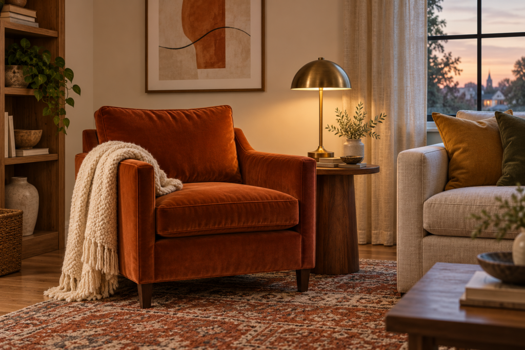
Burnt orange is a deep, muted orange with brown undertones, somewhere between rust, cinnamon, and terracotta. It adds warmth, energy, and a slightly retro richness to a room. It works best as an accent color on upholstery, cushions, rugs, art, and single pieces, or as a full wall color in small, cozy rooms.
Why burnt orange feels different from bright orange
Bright orange can feel loud and playful, which makes it hard to live with in large amounts. Burnt orange has been softened with brown, which gives it the grounded warmth of autumn leaves, clay pots, and old leather. That muted quality lets it sit comfortably alongside wood, stone, linen, and other natural materials, which is exactly why it fits so well into current interiors.
How much burnt orange should you use?
For most rooms, burnt orange works best as the accent in a palette rather than the dominant color. The 60-30-10 guideline is useful here: about 60 percent of the room in a main color like cream or warm white, 30 percent in a supporting shade like sage, olive, or tan, and roughly 10 percent in burnt orange.
In practice, that 10 percent might be a velvet armchair, a few cushions, a throw, a lampshade, and a piece of art. Repeating the color three or more times across the room, rather than placing all of it in one corner, makes it feel intentional.
Where burnt orange looks best
A statement sofa or chair in burnt orange velvet, leather, or boucle is one of the most striking ways to use the color. It gives a neutral living room an instant focal point, and velvet in particular shows off the richness of the shade as light moves across it.
Textiles are the easiest entry point: cushions, throws, rugs with rust tones woven through them, or linen curtains in a muted terracotta.
Dining rooms and studies are good candidates for burnt orange walls. These rooms are often used in the evening, and warm, deep colors glow beautifully under lamplight.
Painted furniture and doors also work well. A burnt orange front door, a painted vintage cabinet, or a kitchen island in a clay or rust tone adds character without changing the whole room.
Does burnt orange work in a small room?
Burnt orange can work well in a small room, especially one used mainly in the evening, such as a study, powder room, or snug. Instead of making the room feel cramped, a deep warm color can make it feel cozy and deliberate. Use a matte finish, paint the trim in the same or a similar tone, and add warm lighting to keep it inviting.
The one place to be cautious is a small room with very little natural light that you use during the day. There, burnt orange can feel heavy. A lighter clay or terracotta, or burnt orange limited to textiles and art, may be the better choice.
What colors go with burnt orange?
Burnt orange pairs well with cream and warm white, sage and olive green, deep teal and navy, chocolate brown, mustard, blush, and natural wood. Blue shades create striking contrast because orange and blue sit opposite each other on the color wheel, while greens and browns keep the look earthy and calm.
Bold Palettes Beyond Sage and Burnt Orange
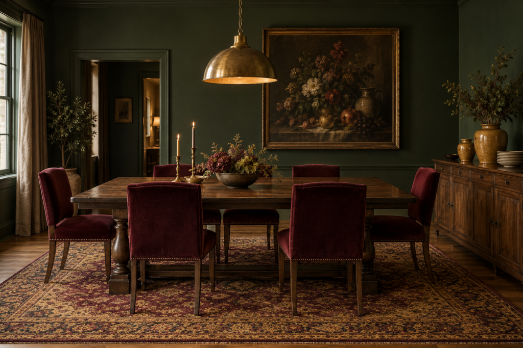
Sage green and burnt orange belong to a much larger family of rich, grounded colors that are showing up in stylish homes. Many of them share the same quality: they’re saturated but softened, with a little brown, gray, or black mixed in so they feel sophisticated rather than bright.
Deep greens: olive, forest, and bottle green
Where sage is soft, these greens are rich and enveloping. Olive green brings warmth and works well on cabinetry and in living rooms. Forest and bottle greens feel traditional yet dramatic, and they look particularly elegant in libraries, studies, and dining rooms, especially paired with brass and dark wood.
Terracotta and clay
Terracotta sits close to burnt orange but with more pink or red in it, like a sun-baked pot. Paler clay tones behave almost like warm neutrals and suit bedrooms and living spaces. Limewash and plaster-effect finishes in these shades are especially popular because the soft, cloudy texture enhances the earthy feel.
Oxblood, burgundy, and deep red
Deep reds have grown in popularity for walls, velvet upholstery, lampshades, and even kitchen cabinetry. Oxblood and burgundy feel moody and luxurious, and a small amount goes a long way. Pairing deep red with pink, cream, or olive keeps it from feeling heavy.
Ochre, mustard, and butter yellow
Ochre and mustard add warmth and a slightly vintage character, lovely in cushions, armchairs, and art. Soft butter yellow is a gentler, more cheerful option for kitchens and breakfast nooks, where it catches morning light nicely.
Chocolate brown
Brown has made a real comeback, replacing black in many rooms as the go-to grounding shade. Deep chocolate works on walls in cozy spaces, in leather and velvet furniture, and as a trim or cabinet color alongside cream.
Navy, ink blue, and teal
Blues remain a reliable bold choice. Navy and ink blue are classic and versatile, working in bedrooms, kitchens, and home offices. Deep teal blends blue and green and pairs beautifully with burnt orange, mustard, and brass.
Plum and aubergine
Rich purple shades are a more unexpected bold choice, bringing depth and a hint of drama to bedrooms, powder rooms, and dining rooms. Balance them with warm neutrals and natural wood.
Can you use sage green and burnt orange together?
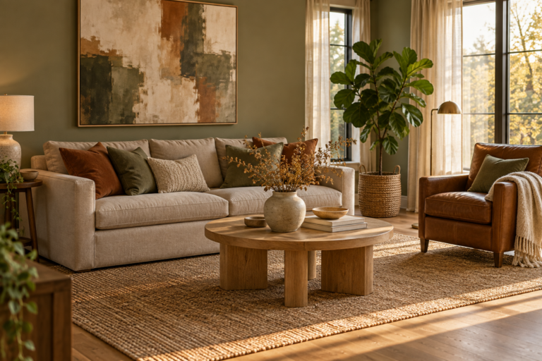
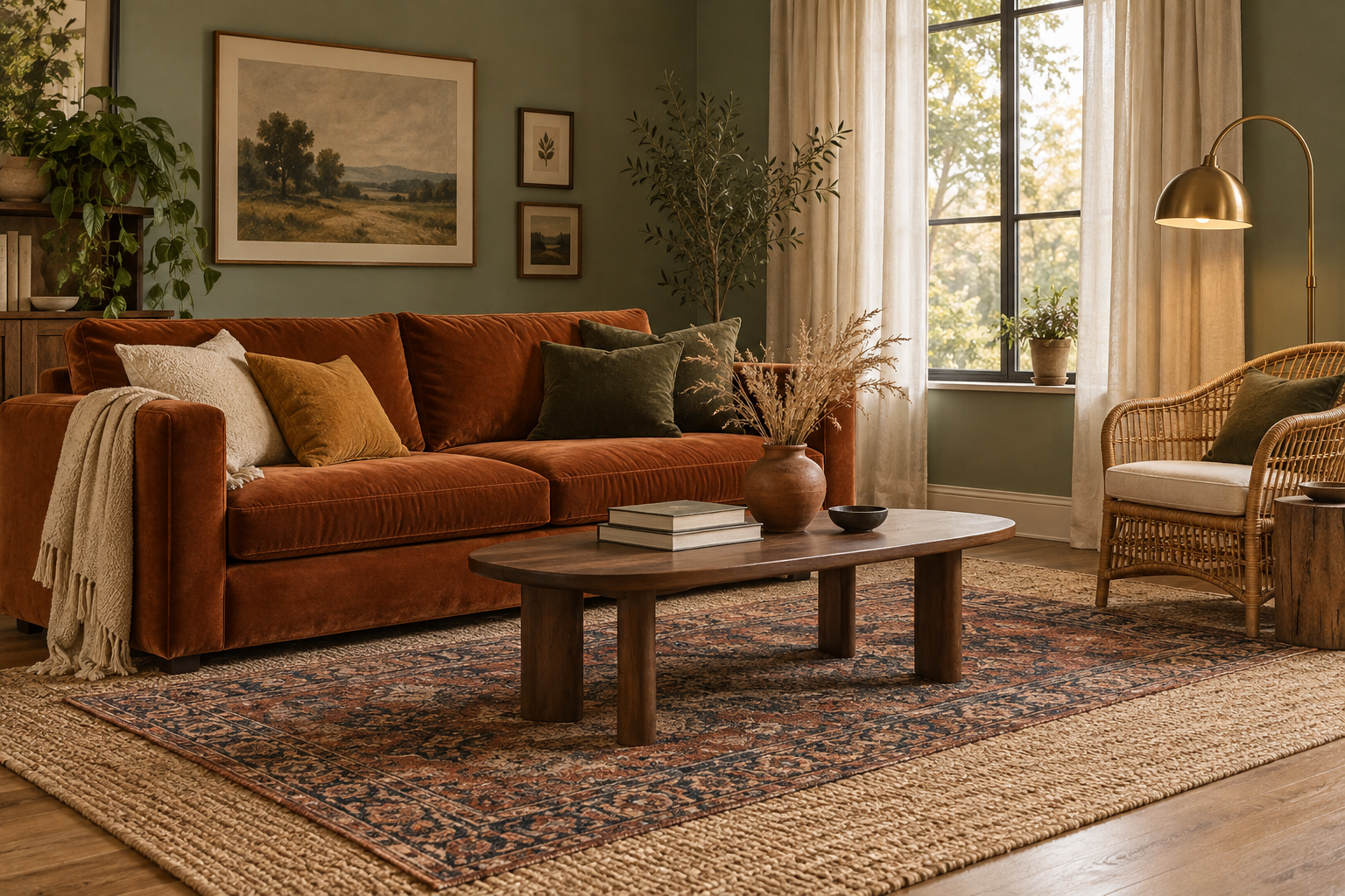
Yes, sage green and burnt orange make a beautiful, balanced combination. The soft, cool calm of sage offsets the warmth and energy of burnt orange, and both share the same muted, earthy quality. A classic approach is sage walls with burnt orange accents in upholstery, cushions, or art, grounded by cream, natural wood, and touches of brass.
Here are some bold palette combinations that work well:
Sage green, burnt orange, cream, and walnut is earthy, warm, and approachable, a strong starting point for living rooms.
Olive, terracotta, ochre, and warm white feels sunny and Mediterranean.
Forest green, oxblood, brass, and dark wood is rich and traditional with a modern edge.
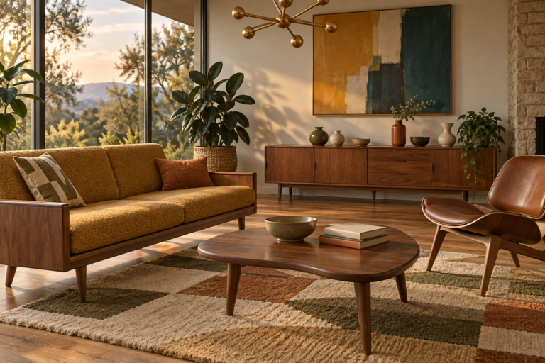
Deep teal, burnt orange, mustard, and cream has a confident, slightly retro character.
Chocolate brown, blush pink, cream, and sage is soft and sophisticated.
Navy, rust, tan leather, and white is classic and easy to live with.
How to Choose and Test a Trending Color for Your Home
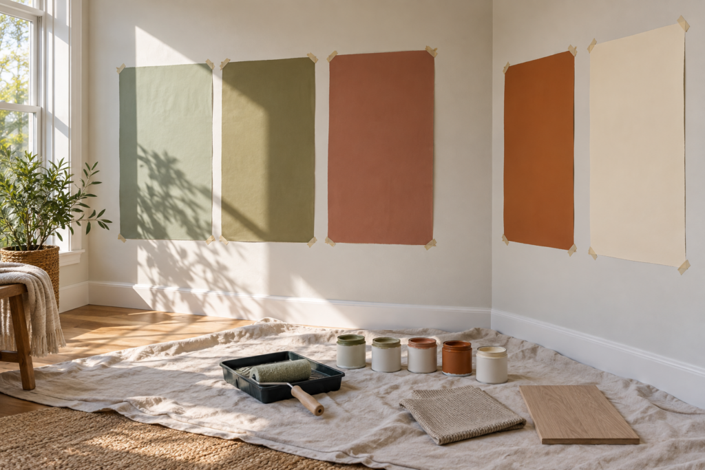
The most reliable way to choose a paint color is to test large samples on several walls and look at them at different times of day for at least a couple of days. Check how the room’s natural light, flooring, and furniture affect the color, and compare its undertones against the fixed elements you won’t be changing.
A small paint chip under store lighting tells you surprisingly little. These steps make the decision far more predictable.
Consider the light in the room
The direction a room faces has a huge effect on color.
North-facing rooms receive cooler, indirect light throughout the day. Cool or gray-leaning colors can look dull and chilly here, so warmer sages, clay tones, and creamy neutrals usually work better.
South-facing rooms get warm, bright light for much of the day. Most colors look lighter and warmer, and cooler shades can help balance strong sun.
East-facing rooms are bright and warm in the morning and cooler later on, so consider when you use the room most.
West-facing rooms are cooler in the morning and glow warm in late afternoon and evening.
Artificial lighting matters as well. Warm bulbs make colors look richer and more yellow, while cool bulbs can make warm colors look slightly muddy.
Work with fixed elements
Start with things that are hard or expensive to change: flooring, countertops, tile, brick, and large furniture. A sage with yellow undertones may clash with pinkish beige tile, while a burnt orange sofa may look odd against red-toned wood floors. Hold your samples right next to these elements.
Test samples the right way
Paint large swatches, roughly the size of a sheet of poster paper, or use peel-and-stick sample sheets. Place them on at least two walls, including one that gets direct light and one in shadow. Look at them in the morning, afternoon, and evening, with lamps on and off. Avoid painting small samples directly on top of your current wall color, since the surrounding shade distorts how the sample looks.
Pay attention to lightness and finish
Paint colors are often given a light reflectance value, which describes how much light a color reflects. A higher value means a lighter color that makes a room feel brighter, while a lower value means a deeper color that absorbs light. Dark colors aren’t wrong in small or dim rooms, but they’ll create a cozy, enveloping effect rather than a bright one.
Finish affects color too. Matte and flat finishes hide wall imperfections and make deep colors look rich and velvety. Eggshell offers a soft sheen with a little more durability for living areas. Satin and semi-gloss are more wipeable, which suits kitchens, bathrooms, trim, and cabinetry, though higher sheens can make colors appear slightly lighter and show surface flaws.
Connect colors from room to room
Trending colors look most intentional when the whole home feels connected. Choose a core palette of about three to five colors and use them in different proportions throughout the house. A hallway might be a warm neutral, the living room a soft sage, and the dining room a deeper olive, with burnt orange showing up in textiles in several rooms. Repeating a wood tone or metal finish from space to space strengthens that flow.
Low-Commitment Ways to Try Bold Colors and Keep Them From Dating
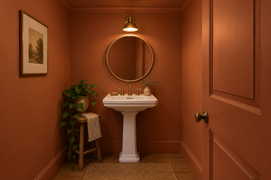
You don’t need to repaint an entire house to enjoy trending colors. The smartest approach puts bold color where it’s easy to change and keeps expensive, permanent surfaces more timeless.
Start with textiles and accessories
Cushions, throws, curtains, lampshades, rugs, and bedding let you try burnt orange, olive, or deep red for a relatively small cost. If you still love the color after a season, you’ll have much more confidence using it on a larger scale. If not, swapping it out is simple.
Try a single piece of furniture
Painting a thrifted dresser, a bookcase, or a pair of dining chairs in a bold shade adds impact without affecting the whole room. A statement armchair or ottoman in burnt orange velvet works the same way.
Paint the unexpected places
Some of the most effective uses of bold color are in surprising spots:
The ceiling, painted a soft sage or warm clay, adds a sense of enclosure and interest, especially in bedrooms.
Interior doors and trim in a deeper tone than the walls can look refined and architectural.
The inside of a bookcase or cabinet painted a bold shade makes shelves feel custom-built.
A kitchen island in sage, olive, or clay gives the room character while the rest of the cabinetry stays neutral.
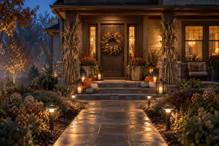
The front door is a classic place to try burnt orange, deep green, or oxblood.
Color drench a small room
Color drenching means painting walls, trim, doors, and sometimes the ceiling in the same color or close shades of it. It’s especially effective in small rooms like powder rooms, studies, laundry rooms, and hallways. The room feels cohesive and deliberate, and it’s a contained way to experiment with a bold palette.
Choosing colors in a rental
If painting isn’t allowed, bold color can still come in through large rugs, curtains, upholstered furniture, bedding, removable wallpaper tested on a hidden patch first, and oversized art. A leaning framed print in burnt orange and olive tones can set a room’s entire palette. Always ask your landlord in writing before painting.
How to keep a trending color from looking dated
Colors date fastest when they’re used everywhere at once, in the same saturated shade, on permanent surfaces. They age best when they’re paired with natural materials, used in balanced amounts, and mixed with pieces from different eras.
A few practical habits help:
Keep expensive fixtures neutral. Save bold color for paint, fabric, and furniture rather than tile, countertops, and bathtubs.
Choose muted versions of bold colors. Softened shades like sage, burnt orange, and olive last longer than bright, pure ones.
Anchor color with natural materials. Wood, stone, linen, wool, and brass keep trending colors grounded.
Pick colors you genuinely love. A shade you’re drawn to year after year will outlast any trend cycle, whether it’s currently fashionable or not.
Frequently Asked Questions
What are the most popular home decor colors right now?
Warm, earthy, and nature-inspired colors are among the most popular, including sage and olive green, burnt orange, terracotta, warm cream, mushroom, chocolate brown, and deep reds like oxblood. Rich blues such as navy and deep teal remain popular too. These colors pair well with natural materials and create a calm yet personal feel.
Is gray still in style for home decor?
Cool grays have become less common as warmer neutrals like cream, greige, sand, and mushroom have taken their place. Gray isn’t a mistake, though. If your home has gray walls or furniture, you can warm the space with wood tones, earthy textiles in rust or olive, brass accents, and warm-toned lighting before deciding whether to repaint.
What is the best sage green paint color for a north-facing room?
In a north-facing room, choose a sage green with warm or slightly yellow undertones. Cooler, gray-leaning or blue-leaning sages can look dull and chilly in the cool, indirect light these rooms receive. Test large samples on several walls and view them in both morning and evening light before committing.
Is burnt orange a good color for a bedroom?
Burnt orange can work well in a bedroom when it’s used thoughtfully. As bedding, a headboard, cushions, or a single accent wall, it adds cozy warmth. For full walls, choose a softer clay or terracotta variation and balance it with cream, natural wood, and calm textiles so the room still feels restful.
What colors make a room look bigger?
Light colors with a higher light reflectance value, such as warm whites, soft creams, and pale sage, generally make rooms feel larger and brighter. Painting walls and trim in similar tones also reduces visual breaks. That said, deep colors used in a room from top to bottom can blur its edges and create a cozy, intentional feel rather than a cramped one.
What are good kitchen cabinet colors that aren’t white?
Sage green, olive, deep forest green, navy, warm greige, clay, and even chocolate brown are all attractive alternatives to white kitchen cabinets. Pair colored cabinets with light countertops, a simple backsplash, natural wood, and brass or black hardware. Painting only the island or lower cabinets is a lower-commitment way to try a bolder shade.
How do I pick an accent color for a neutral room?
Look at the colors already present in your art, rug, or a favorite textile and pull one of those shades out as your accent. Earthy options like burnt orange, olive, or ochre work with most warm neutral schemes. Repeat the accent in at least three places across the room so it feels planned rather than random.
How many colors should I use in one room?
Most rooms feel balanced with three to five colors, including neutrals. A common approach is one dominant color covering about 60 percent of the room, a secondary color around 30 percent, and an accent at roughly 10 percent. Natural wood, metals, and plants add depth without counting as additional colors.