Interior Design Photos: Inside Beautiful, Stylish Homes and What Makes Them Work
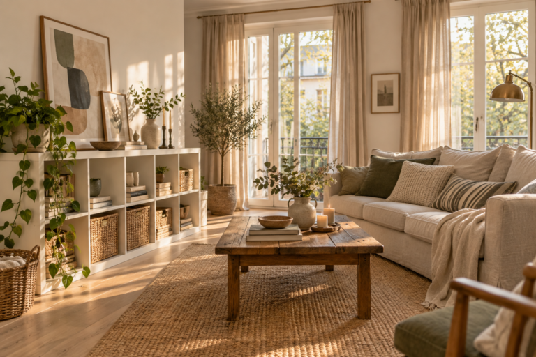
There’s a particular kind of photograph that stops people mid-scroll. Late sun falls across a linen sofa, a stack of books sits at an easy angle on an old wooden table, and a single branch leans out of a clay vase. You can almost feel the temperature of the room. Most of us save dozens…
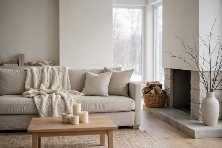
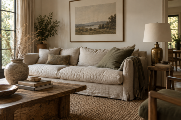
There’s a particular kind of photograph that stops people mid-scroll. Late sun falls across a linen sofa, a stack of books sits at an easy angle on an old wooden table, and a single branch leans out of a clay vase. You can almost feel the temperature of the room. Most of us save dozens of images like that, then look around our own living room and wonder why it doesn’t feel remotely the same.
The gap usually isn’t money. It’s that beautiful interior design photos contain a lot of quiet decisions that are easy to admire and hard to spot: where the light comes from, how furniture is spaced, why three colors repeat around the frame, what was taken out of the room before the shutter clicked.
This is a walk through the kinds of stylish homes that fill magazines and saved-image boards, room by room and style by style, with the reasoning behind each one laid out plainly. Along the way you’ll learn how to read a photo the way a designer does, why rooms often look better on screen than in real life, and how to turn a folder of inspiration into a home that actually works for you.
How to Read an Interior Design Photo Like a Designer
To read an interior design photo like a designer, look past the individual objects and study the structure: where the light enters, what the eye lands on first, how colors repeat, how much empty space surrounds each piece, and how the furniture is scaled to the room. Those patterns, not the specific sofa, are what you can actually recreate.
When people save an inspiration image, they usually fixate on a single item. They want that exact lamp or that particular rug. But a room rarely looks beautiful because of one object. Try working through a photo in this order instead.
Find the light first
Almost every striking interior photo has a clear light source, usually a large window just out of frame. Notice which direction it comes from and how it falls. Soft side light creates gentle shadows that show off texture in linen, plaster, and wood. Then look for the secondary light: a lamp glowing in a corner, a picture light over art, a pendant over the table. Well-designed rooms almost always have light coming from several heights, which gives them depth even in a flat image.
Notice where your eye lands
Glance at the photo for two seconds, look away, and ask what you remember. That’s the focal point. It might be a fireplace, a dramatic headboard, a large painting, or a view. Now look at how the rest of the room supports it. Seating usually faces it, colors often echo it, and nothing nearby competes too loudly for attention.
Count the colors
Most rooms that feel cohesive in photographs use a restrained palette, commonly a dominant neutral, one or two supporting colors, and a small accent. Pick out the accent color and track where it appears. In a well-styled room it tends to show up three or more times, perhaps in a cushion, a book spine, and a piece of art on the far wall, which pulls the whole frame together.
Look at the empty space
The space between objects is as deliberate as the objects themselves. Shelves in magazine photos are rarely full. Coffee tables usually hold a few items grouped together rather than scattered. Walls have breathing room around art. If a room in a photo feels calm, count how many surfaces are left bare.
Check the scale
Scale is where many copied rooms go wrong. Look at the rug relative to the furniture, the art relative to the wall, and the pendant relative to the table. In most well-designed living rooms, the rug is large enough to sit under at least the front legs of the seating, and artwork above a sofa spans roughly two-thirds of its width. A room recreated with the right pieces at the wrong sizes will never look like the photo.
Spot the mix of old and new
Very few beautiful homes are furnished entirely from one shop. Look closely and you’ll usually find something with age: a worn rug, an antique chest, a vintage lamp, a painting with a cracked gilt frame. That contrast is a big part of why photographed homes feel collected and personal rather than showroom-perfect.
Inside Stylish Living Rooms: What the Best Photos Have in Common
Living rooms dominate interior design photography because they carry the most personality. Three very different types of living room show up again and again in beautiful home photos, and each teaches something useful.
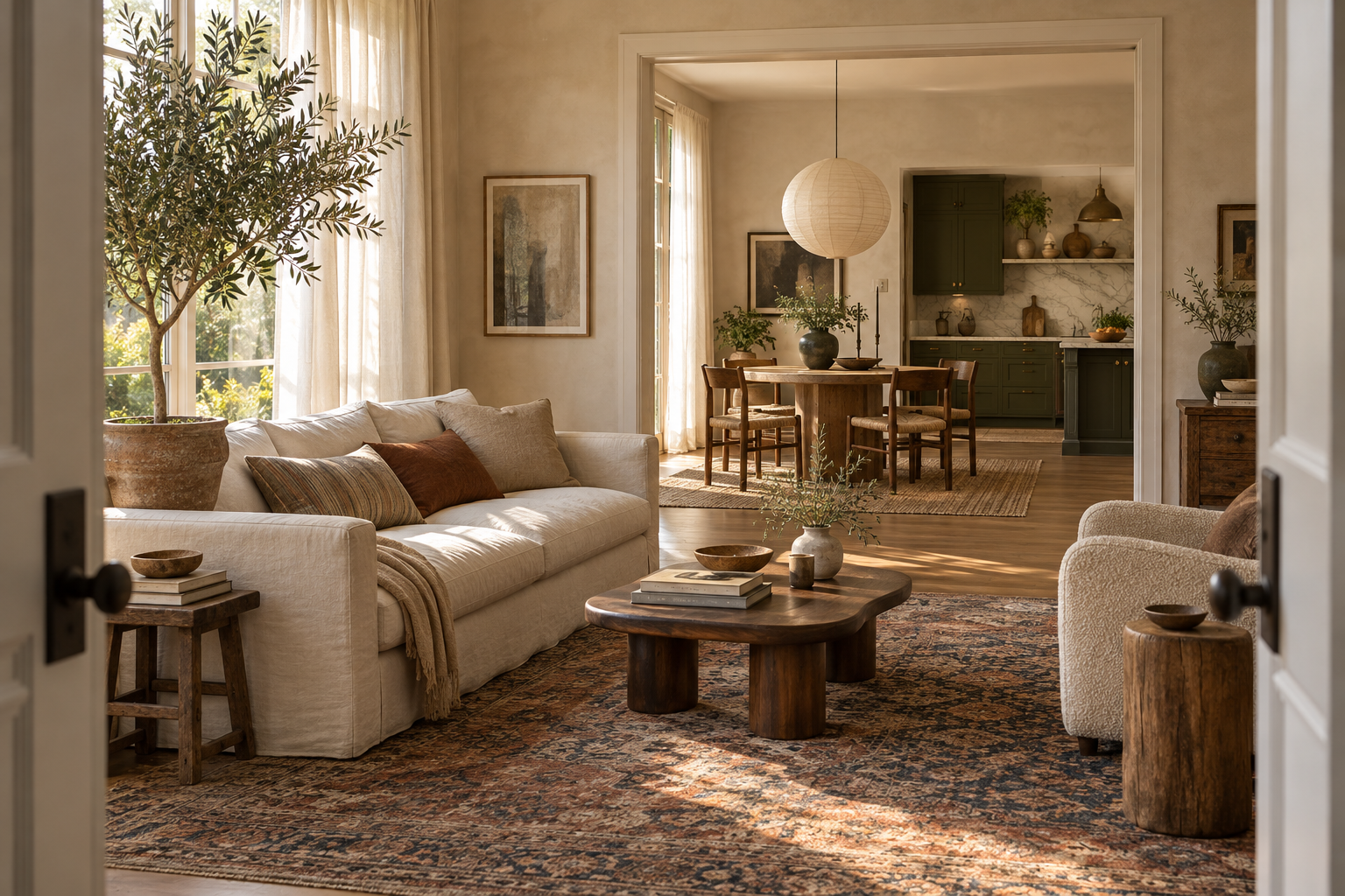
The warm, pared-back modern living room
Picture a large room with pale plaster-textured walls, wide oak floorboards, and a low, deep sofa in oatmeal linen. A curved coffee table in dark walnut sits on a flat-woven wool rug. There’s a single large abstract painting in soft ochre and charcoal, one sculptural floor lamp, and a tall olive tree in a terracotta pot beside the window.
What makes it work is restraint paired with texture. The palette barely has any color, yet the room never feels cold, because every surface has a different feel: rough plaster, nubby linen, smooth wood, matte clay. Curved shapes soften the straight lines of the architecture. The emptiness is intentional, and the few objects are large enough to hold their own.
To borrow this look, choose fewer, bigger pieces and prioritize natural materials over color. A limewash or plaster-effect paint finish can give ordinary drywall a similar softness.
The traditional townhouse parlor with a modern edge
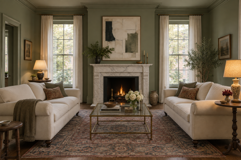
This one has tall ceilings, deep crown moldings, and a marble fireplace. The walls are painted a rich, muted green, and the trim is drenched in the same shade. A pair of classic rolled-arm sofas face each other across a low brass-and-glass coffee table, with an antique rug underneath in faded reds and blues. A contemporary print hangs above the mantel, and a mismatched pair of vintage lamps sits on either side.
The lesson here is symmetry used as structure, then broken gently. The facing sofas and central fireplace create a formal, balanced layout, while the modern art, unmatched lamps, and saturated wall color keep it from feeling stiff or old-fashioned. Painting walls and trim the same color also makes traditional moldings look deliberate and modern.
The eclectic, collected bungalow
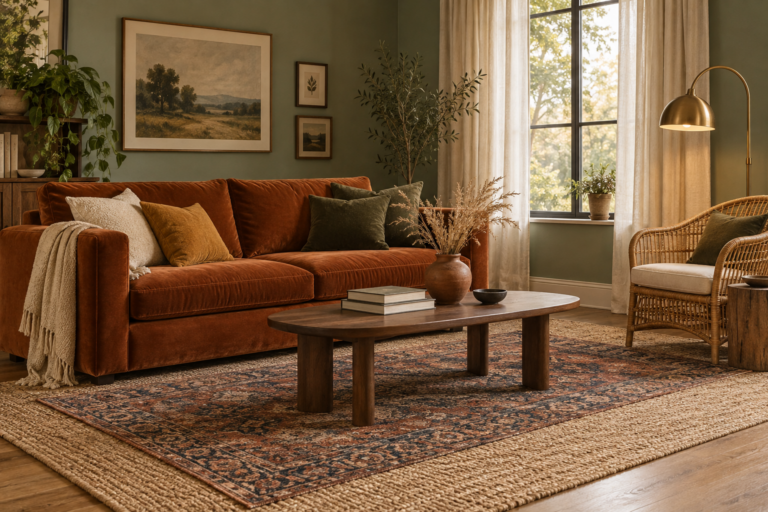
Here the room is smaller and fuller. A velvet sofa in deep rust sits under a salon-style wall of framed art in different sizes. There are patterned cushions, a rattan chair, a stack of travel books, a thrifted brass floor lamp, and plants on nearly every surface with sun. A patterned rug overlaps a larger jute one.
It could easily be chaos, but it isn’t, and the reason is repetition. Look at a photo like this carefully and the same three or four colors, often rust, olive, cream, and a touch of blue, run through the art, textiles, and books. The frames on the gallery wall share an overall outer boundary, so the grouping reads as one large shape. Maximalism works when there’s a hidden order.
What these living rooms share
Despite looking completely different, all three have a clear focal point, a rug scaled properly to the seating, lighting at multiple heights, at least one piece with visible age, and a palette you could describe in a few words. Those are the elements worth carrying into your own space, whatever style you prefer.
Kitchens and Dining Rooms That Photograph Beautifully
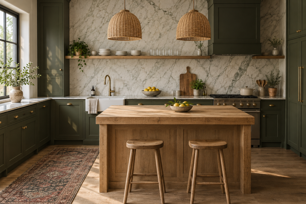
Kitchens look best in photos when their permanent surfaces are simple and their styling is personal. Think of a restrained backdrop of cabinetry, stone, and wood, then a few lived-in touches like a stack of bowls, a cutting board leaning against the backsplash, a bowl of lemons, or a vintage runner on the floor.
The deep-colored kitchen
One of the most admired kitchen looks in recent interior design photography uses deeply colored cabinetry, often olive, forest green, navy, or warm plum, paired with a pale marble or quartz backsplash that runs up the wall. Unlacquered brass taps and hardware slowly develop a patina. A single long open shelf in natural wood holds everyday plates and glasses.
The strong cabinet color gives the room its character, but the light counters, simple backsplash, and warm metals prevent it from feeling heavy. Keeping upper cabinets minimal or replacing some with a shelf helps the room feel open.
The white kitchen that isn’t sterile
Plenty of stunning kitchens are still white or cream, but the ones that photograph well avoid a flat, clinical look. They use warm whites rather than stark ones, add a butcher block or oak island, include textured tile such as handmade-style zellige, and bring in a vintage rug or wooden stools. A pendant in rattan, paper, or aged brass adds warmth overhead.
Dining rooms with atmosphere
Beautiful dining room photos almost always center on the light fixture. A generously sized pendant, hung roughly 30 to 36 inches above the table surface, anchors the room and creates a pool of warm light. Tables are often round in smaller spaces, since they encourage conversation and ease movement, or long and rectangular in narrow rooms.
Mismatched chairs are common in stylish dining rooms, whether that’s upholstered chairs at the ends and wooden ones along the sides, or an entirely collected set that shares only a wood tone. Walls in dining rooms tend to be bolder than elsewhere in the home, and color drenching, where walls, trim, and sometimes ceiling share one color, gives dining rooms a cocooning, candlelit feel.
How do stylists make kitchens look so clean in photos?
Stylists clear almost everything off the counters before a shoot, including kettles, dish racks, chargers, and mail, then add back a few carefully chosen objects. It’s a useful trick in real life too. Choose one or two everyday items worth displaying, like a good wooden board or a ceramic crock of utensils, and find closed storage for the rest.
Bedrooms and Bathrooms: Calm, Private, and Surprisingly Bold
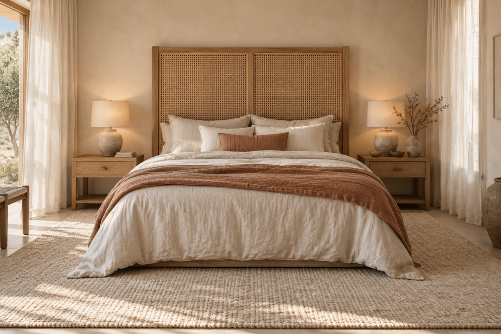
Bedrooms that look like a retreat
The bedroom photos people save most often share a feeling of calm. The palette is usually soft, with warm whites, sand, clay, sage, or dusty blue. Bedding is layered in natural fabrics like washed linen and cotton, with a textured throw folded at the foot. The bed is anchored by a headboard that’s taller or more substantial than average, whether upholstered, caned, wooden, or simply a painted arch on the wall.
Look closely and you’ll see a few consistent details. Curtains hang close to the ceiling and extend well past the window frame, often floor-length, which makes rooms appear taller and windows larger. Bedside lamps give warm, low light instead of relying on an overhead fixture. Nightstands hold very little, perhaps a lamp, a book, and a small dish. A large rug extends out beyond the sides of the bed so bare feet land on something soft.
Some of the most memorable bedroom photos go the other way, with dark walls in charcoal, deep green, or inky blue. Dark bedrooms feel cozy rather than gloomy when they’re paired with warm lighting and plenty of texture in the bedding and rug.
Bathrooms with personality
Bathrooms are where many beautiful homes take their biggest risks, because the room is small and you spend limited time there. Stylish bathroom photos often feature a freestanding tub, a vintage or arched mirror, patterned or handmade-look tile, and warm metal fixtures in brushed brass or aged bronze. Powder rooms in particular appear in bold wallpaper or completely drenched in a single saturated color.
Small styling details make a big difference in these photos. Folded towels in a natural linen or waffle weave, a wooden stool beside the tub, a small plant that tolerates humidity, and a single candle or ceramic soap dish do more than any row of products. As with kitchens, most of what’s normally on a bathroom counter disappears before the photo is taken.
Can you recreate these bedroom and bathroom looks on a budget?
Yes. Much of what makes these rooms photograph well is inexpensive. New bedding in natural fabric, curtains rehung higher, warm-toned bulbs, and a painted headboard shape on the wall can transform a bedroom. In bathrooms, swapping a plain mirror for a vintage one, upgrading towels, changing hardware, and painting the walls a deeper color deliver most of the effect without replacing tile.
Style by Style: Recognizing Common Looks in Interior Design Photos
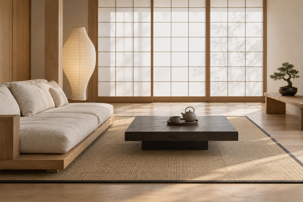
Knowing the names of common styles helps you search for more of what you like and describe it clearly to a designer or salesperson. Most beautiful homes blend two or more of these, but each has recognizable signatures.
Modern organic
Modern organic interiors pair clean, simple furniture with natural materials and soft shapes. You’ll see warm neutrals, curved sofas, travertine or stone, oak and walnut, linen and boucle, and large indoor plants. Rooms feel calm and uncluttered but never cold.
Scandinavian
Scandinavian rooms are bright and practical, with white or very pale walls, light wood floors, simple furniture on slim legs, cozy wool textiles, and a strong focus on natural light. Decoration is minimal, and every piece tends to have a purpose.
Japandi
Japandi combines Japanese minimalism with Scandinavian comfort. Look for low furniture, darker and lighter woods together, handmade ceramics, paper lanterns, muted earth tones, and a strong sense of order. Clutter is almost entirely absent.
Mid-century modern
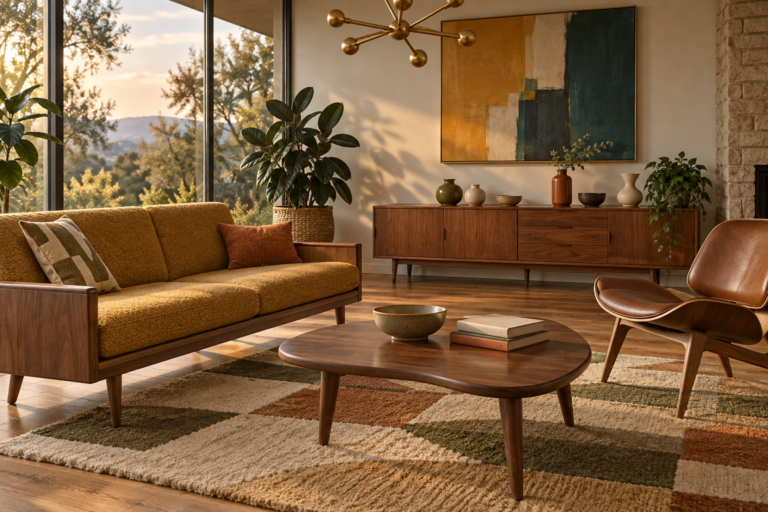
Mid-century rooms feature furniture with tapered legs, low profiles, and organic curves, usually in teak or walnut. Colors often include mustard, olive, orange, and teal alongside warm wood. Geometric patterns and sculptural lighting are common.
Traditional and transitional
Traditional homes use classic furniture shapes, symmetrical layouts, moldings, antique rugs, and rich fabrics. Transitional design takes those classic bones and simplifies them with cleaner lines, calmer palettes, and more modern art and lighting. It’s one of the most widely lived-in styles because it adapts to almost any house.
Modern farmhouse and rustic
Farmhouse interiors feature shiplap or paneling, exposed beams, reclaimed wood, black metal accents, and comfortable, durable furniture. The newer versions lean warmer and less stark, with more wood, antiques, and softer colors in place of all-white walls.
Eclectic and maximalist
Eclectic homes combine periods, patterns, and places. You might see a Victorian chair beside a modern lamp, layered rugs, gallery walls, bold wallpaper, and collections on display. The best examples feel curated because color and material repeat through the space.
How do I figure out my style from the photos I’ve saved?
Gather twenty or thirty images you love and look for what they share rather than what’s in each one. Note whether the rooms are light or dark, full or spare, colorful or neutral, curved or angular, and polished or rustic. The repeated answers describe your style far better than any label, even if it turns out to be a blend.
Why Rooms Look Better in Photos Than in Person, and How to Close the Gap
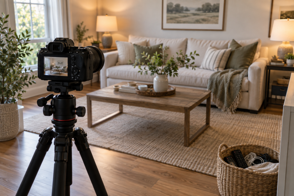
Rooms often look better in professional photos because they’ve been styled, lit, and edited for the camera. Stylists remove clutter, photographers use wide lenses and carefully timed daylight, and furniture may be moved just for the shot. Knowing these techniques helps you use inspiration images realistically and even photograph your own home well.
What happens behind a styled home photo
A professional shoot involves far more preparation than people realize. Personal clutter disappears: cords, remote controls, mail, toys, and bottles. Fresh flowers, branches, or fruit are added for life and color. Cushions are plumped and chopped, throws are folded with deliberate looseness, and books are restacked by color or size.
Furniture is frequently shifted closer together or angled toward the camera, since a layout that looks balanced in a photo may not be comfortable to walk through. Photographers often shoot with a wide-angle lens from a low height, around chest level, which makes rooms feel more spacious. Most interior photos are taken in soft daylight with lamps switched on for warmth, then edited to straighten vertical lines, balance color, and brighten shadows.
None of that is dishonest, but it means a photo shows a room at its most perfect moment rather than on an ordinary Tuesday evening.
How to use interior design photos for inspiration without copying
The most effective way to use inspiration photos is to extract principles rather than products. From each image, write down one or two things you can apply: a paint color family, a lighting arrangement, a rug size, a mix of materials, a way of styling shelves.
A simple mood board helps. Gather a handful of your favorite images alongside real paint samples, fabric swatches, and wood finishes from your own home, then see whether the combination holds together in your light. Always factor in your actual room. A photo of a sunny, south-facing loft with tall ceilings won’t translate literally into a north-facing bedroom with low ceilings, but its palette or texture might, adjusted to warmer or lighter shades.
Also think about how you live. White boucle and a glass coffee table look lovely in photos, yet may not suit a home with a dog and young children. Performance fabrics, washable slipcovers, and sturdy wood surfaces can deliver a similar look with far less worry.
How to photograph your own home interior
To take better photos of your home, shoot in soft daylight with all lamps turned on, clear surfaces of clutter, hold the camera or phone at chest height, and keep vertical lines straight. Stand in a corner or doorway to capture more of the room, and turn off overhead lights, which often cast harsh shadows.
A few extra details help noticeably. Clean the lens first, since fingerprints soften phone photos. Avoid shooting directly into a bright window, which darkens the rest of the room, and instead position yourself so the window light falls across the scene from the side. Take detail shots too, such as a styled shelf, a bedside table, or a corner chair, because close-ups often convey the feel of a home better than wide views. If you’re photographing a home for sale or rent, depersonalize a little more than usual so viewers can imagine themselves living there.
Closing the gap in your own rooms
Most of what makes photographed homes beautiful can be brought into everyday life with a few habits. Keep lighting layered and warm. Give surfaces breathing room. Repeat your core colors through the room. Choose rugs and art at generous sizes. Add something old, something handmade, and something living. Then do a short reset each evening, straightening cushions and clearing the coffee table, and your home will feel much closer to the images that inspired it.
Frequently Asked Questions
Where can I find good interior design photos for inspiration?
Interior design magazines, design books, image-sharing and social media platforms, home improvement websites, and portfolios of interior designers and architectural photographers are all rich sources. Show houses, hotel and restaurant interiors, and real estate listings can also be surprisingly inspiring. Save images consistently in one place so you can later look for patterns across them.
Why do my rooms look dark and small in photos?
Rooms usually look dark and small in photos because of overhead lighting, shooting at the wrong time of day, or holding the camera too high or too close. Photograph in soft daylight with lamps on, stand in a corner or doorway, hold the camera at chest height, and use a wide setting to capture more of the space.
Can I recreate a room from a photo on a budget?
You can recreate the feel of most rooms on a budget by copying the palette, lighting, rug size, and styling rather than buying identical pieces. Secondhand furniture, paint, affordable natural textiles, and well-framed inexpensive art get you surprisingly close. Focus spending on the one or two pieces that define the look, such as the sofa or light fixture.
What makes a room look expensive in photos?
Rooms look expensive in photos when they have good natural light, generous scale, restrained color, and quality-looking materials like wood, stone, linen, and brass. Floor-length curtains hung high, large artwork, uncluttered surfaces, and a few antique or handmade pieces add polish. Careful styling and straight, well-composed camera angles also contribute a great deal.
What is the best time of day to take interior photos?
The best time is usually when soft, indirect daylight fills the room, which varies with the direction your windows face. Many rooms photograph well mid-morning or mid-afternoon on a bright but slightly overcast day. Avoid harsh midday sun streaming straight in, which creates strong shadows and blown-out highlights.
How do I combine ideas from different interior design photos?
Choose one photo or style as your primary direction and treat others as sources for smaller accents. Tie ideas together with a consistent color palette and repeated materials, such as the same wood tone or metal finish throughout. Testing combinations on a mood board with real samples before buying helps avoid a room that feels disjointed.
Are the homes in interior design photos realistic to live in?
Many photographed homes are genuinely lived in, but they’re shown at their tidiest after careful styling. Everyday items are temporarily removed, and furniture is sometimes rearranged for the camera. Treat photos as a guide to palette, layout, and mood, then adapt the ideas to your routines, storage needs, children, and pets.