Wall Decor Ideas: Art, Signs and Accessories to Style Your Walls
Blank walls are the last thing most people deal with, and it shows. Furniture gets chosen carefully, paint gets three sample patches, and then a single small print goes up somewhere around shoulder height because it was the thing that was available, and there it stays for six years. The strange part is that walls…
Blank walls are the last thing most people deal with, and it shows. Furniture gets chosen carefully, paint gets three sample patches, and then a single small print goes up somewhere around shoulder height because it was the thing that was available, and there it stays for six years.
The strange part is that walls are the largest visible surface in almost every room. More wall is visible than floor, more than furniture, considerably more than the ceiling. Getting them wrong makes a well-furnished room feel unfinished. Getting them right can rescue a room full of ordinary furniture.
Most of what goes wrong is technical rather than aesthetic. Things hung too high. Art too small for the wall behind it. Frames scattered evenly instead of grouped. Nothing at eye level, everything floating near the ceiling. These are measurable problems with measurable fixes, which is good news, because it means you do not need taste to correct them, only a tape measure.
The Heights, Sizes and Spacing That Fix Most Wall Problems
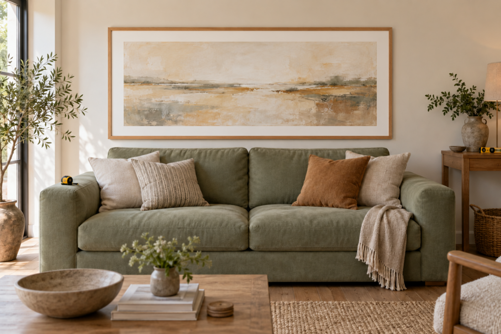
Hang the centre of a single artwork at 145cm (57 inches) from the floor, which matches average standing eye level and is roughly what galleries use. Treat a group of frames as one large rectangle and centre that rectangle at the same height. Keep 5 to 8cm (2 to 3 inches) between frames in a group. Fill 60 to 75 percent of the width of the furniture a piece hangs above. Almost every wall that looks wrong is breaking one of these four rules.
Hanging too high is the most common error by a wide margin, and it happens because people hang from where they are standing rather than measuring. The result is art drifting toward the ceiling with a dead zone of blank wall beneath it, which makes the ceiling feel lower and disconnects the art from the furniture entirely.
A few adjustments to the basic 145cm rule are worth knowing:
Above furniture, the measurement changes. Leave 15 to 25cm (6 to 10 inches) between the top of the sofa, console or headboard and the bottom of the frame. This gap is what makes art and furniture read as a single arrangement rather than two separate things. Any more and the connection breaks.
In rooms with very high ceilings, raise the centre point slightly, perhaps to 150 to 155cm, but resist the urge to hang everything high. The eye still reads from standing height. The better solution in a tall room is larger art or a stacked arrangement rather than the same small piece pushed upward.
In a room where people are mostly seated, such as a dining room or a den, dropping the centre by 5 to 10cm makes the art sit better in the sightline.
Along a staircase, follow the angle of the stairs rather than the floor, keeping each piece at 145cm measured from the nose of the step directly beneath it. Frames should step evenly rather than staying level, which produces the diagonal line that makes stair galleries work.
Size is the other half of the equation. Art that is too small is the second most common problem, and it is expensive to fix because the usual answer is buying something bigger. Above a sofa, aim for the art or arrangement to span roughly two thirds to three quarters of the sofa’s width. Above a console or sideboard, the same ratio applies. On an empty wall with nothing beneath it, aim for the piece to occupy around 60 percent of the available wall width between obstructions.
If you already own a piece that is too small for its wall, there are three fixes: reframe it with a much wider mat and a larger frame, which can easily double its footprint; group it with other pieces so the arrangement provides the scale; or move it somewhere smaller, such as a hallway, a bathroom or a narrow strip of wall between windows.
Why does my art look wrong even though I hung it at the right height?
Usually because the height is correct in isolation but wrong in relation to what is around it. A piece hung at exactly 145cm above a very low sofa can still leave an awkward gap, and a piece hung correctly above a console can still look stranded if it is much narrower than the furniture.
Three other causes account for most of the rest. The frame may be too thin and light for the wall’s scale, which makes the piece look like a postage stamp regardless of its actual size. The mat may be too narrow, since generous mats make modest art look considerably more substantial. Or the wall may simply need more than one thing, with a single small object on a large expanse always looking marooned no matter where it sits.
There is also the horizontal question, which people rarely check. Art should be centred on the furniture below it, not on the wall, when the two do not align. If a sofa sits off-centre on a wall, the art goes above the sofa.
Gallery Walls: Layouts That Work and How to Plan One
A gallery wall is a group of framed pieces arranged as a single composition. The two reliable approaches are the grid, meaning identical frames in even rows and columns, and the salon hang, meaning mixed frames arranged organically around a strong central piece. Both work. The version that fails is the one with no system at all.
The grid is the easiest to get right and the most formal. Identical frames, identical mats, even spacing, arranged in a rectangle. It suits a set of related images, such as botanical prints, architectural drawings, a series of photographs, or pages from an old book. Because everything matches, the only thing that can go wrong is uneven spacing, so measure carefully and use a spirit level.
The salon hang is denser, more forgiving of mixed content, and significantly harder to plan. The method that works: choose one large anchor piece, place it slightly off-centre within the intended area, then build outward with progressively smaller pieces, keeping the outer edges of the whole arrangement roughly rectangular. Consistent gaps hold it together even when nothing else matches.
The ledge or picture rail is the low-commitment option. Mount one or two narrow shelves and lean frames against the wall, overlapping them slightly. Nothing is fixed, so the arrangement can change in five minutes, and it works particularly well in rentals and in rooms where the display will evolve.
The linear hang runs a single row of frames at consistent height along a hallway or above a long piece of furniture. Simple, orderly and very effective in corridors.
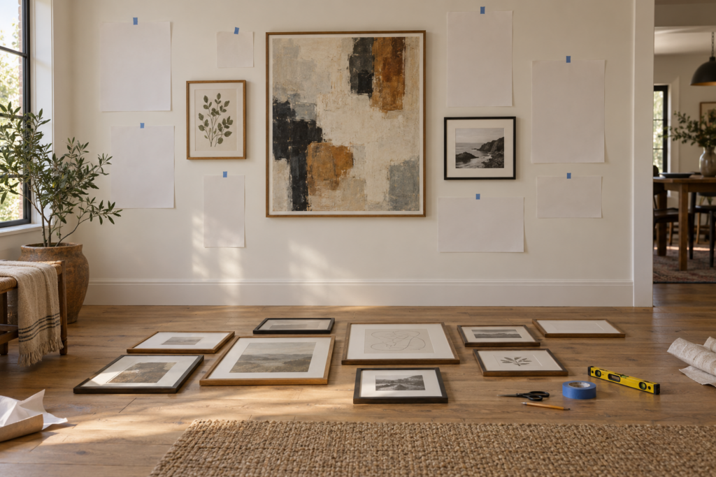
However you arrange it, the planning method is the same and it is worth the twenty minutes:
- Lay every piece out on the floor in the approximate footprint of the wall, and rearrange until the composition balances. Take a photo, which makes imbalance obvious in a way that looking directly does not.
- Cut paper templates for each frame, marking the hanging point on each one.
- Tape the templates to the wall with low-tack tape and live with them for a day. Adjust in the morning and the evening, since the arrangement will look different in different light.
- Hammer the nail or hook straight through the marked point on the template, then tear the paper away.
A few composition points that make the difference between a good gallery wall and a chaotic one. Give each piece some breathing room, since gaps under 5cm start to look crowded and gaps over 10cm break the group into separate objects. Balance visual weight rather than size, because a dark, dense image carries more weight than a pale one of the same dimensions. Keep the outer boundary of the arrangement roughly rectangular even in a salon hang, since a ragged outline reads as accidental. And vary orientation deliberately, mixing portrait and landscape pieces so the composition has some movement.
Frames are where a mixed gallery either holds together or falls apart. The reliable approach is to vary the frames but repeat the finishes, so that each finish appears at least three times. A wall of oak, black and antique gold frames works beautifully if there are three or more of each. One gold frame among twelve black ones looks like a mistake. Alternatively, use identical frames and let the images do all the varying, which is the most foolproof route of all.
How do I make a gallery wall from things I already own?
Almost anything flat can be framed, and framing is precisely what turns an object into art. The declaration of intent is most of the effect.
Sources worth raiding: pages from old books and atlases, particularly plates from botanical, ornithological or anatomical volumes; postcards and vintage travel ephemera; children’s drawings, which look startlingly good framed properly with a generous mat; fabric scraps, a piece of a vintage scarf or an embroidered handkerchief stretched and framed; sheet music and old letters; pressed flowers and leaves; record sleeves; concert or exhibition tickets grouped in one frame; and photographs printed large rather than small, which is the cheapest way to get scale.
Two things elevate cheap content dramatically. Mat generously, meaning a mat considerably wider than feels necessary, which is what makes gallery framing look expensive. And use consistent frames, since matching frames make mismatched contents look like a deliberate collection.
For genuinely inexpensive frames, charity shops and secondhand markets are full of them, often with dated prints inside that can be discarded. A mixed haul of old frames spray-painted a single colour becomes a coherent set for very little.
What to Hang Above a Sofa, Bed, Console and Mantel
Each of these walls has its own rules, largely because the furniture beneath determines the scale and the gap.
Above a sofa is the most-asked question in wall decorating. The arrangement should span roughly two thirds to three quarters of the sofa’s width, with 15 to 25cm of gap between the sofa back and the bottom of the frame. One large piece is the simplest solution and often the best. Two or three pieces in a row work well. A denser gallery works if the sofa is plain. What consistently fails is a single small frame, which makes the sofa look enormous and the wall look empty.
Above a bed, the options are wider than most people realise. A single large piece centred on the bed is the standard. A pair of matched pieces, one above each side, creates symmetry that suits bedrooms. A woven or textile hanging is softer than glass and avoids the anxiety of something heavy above a sleeping head. An upholstered or carved headboard can also do the whole job, in which case the wall needs nothing at all. If you do hang something heavy above a bed, fix it into a stud or use proper heavy-duty fixings, and consider using a cleat system rather than a single hook.
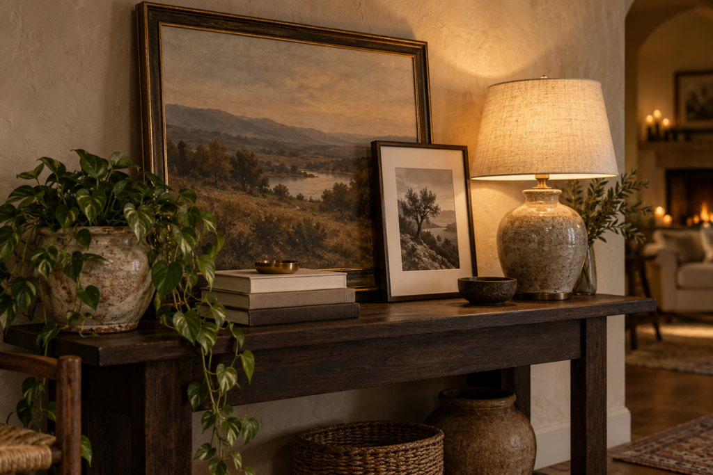
Above a console or sideboard, the art should relate to the furniture width rather than the wall, and the arrangement can be layered rather than hung. Leaning a large framed piece against the wall on the console surface, with a smaller piece overlapping in front of it, is one of the easiest ways to make a console look styled. Add a lamp at one end and a plant or tall object at the other to frame the composition.
Above a mantel, the traditional solution is a single large piece or a mirror centred on the chimney breast. Leave 10 to 15cm between the mantel shelf and the bottom of the frame. Leaning rather than hanging is very effective here and lets you change things easily. The arrangement should relate to the width of the fireplace opening or the mantel itself, whichever is more visually dominant.
Above a dining table or in a dining room, drop the hanging height slightly since everyone is seated, and consider a horizontally oriented piece or a row of pieces, which suits the shape of the room.
In a hallway, linear arrangements at consistent height work best, since people move past rather than stopping. Hallways are also the right place for the pieces that are too small to carry a main wall, because you see them from close range.
Beyond Framed Art: Mirrors, Textiles, Shelves and Objects
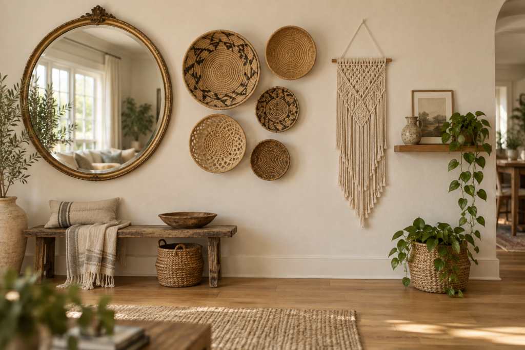
Framed art is the default, but walls take many other things, and a room where every wall holds framed pictures can start to feel flat and repetitive. Mixing categories adds depth.
Mirrors do double work, reflecting light and apparently expanding a room. The most effective placement is opposite or perpendicular to a window, where the mirror bounces daylight back into the space. Avoid hanging one directly facing a wall of clutter, since it doubles that too. A large mirror above a console or mantel is the classic use. A full-length leaning mirror in a bedroom or hallway suits the style of almost any room and requires no drilling. Antique and ornate frames are worth hunting secondhand, since a good old mirror frame is itself a piece of sculpture.
Textiles soften a wall in a way glass and frames cannot. Woven wall hangings, macramé, a vintage kilim or a fragment of an old rug, a quilt hung from a discreet cleat, batik or block-printed cloth, or a large piece of fabric simply stretched over a frame. Textiles also absorb sound, which is genuinely useful in a room with hard floors and an echo.
Shelves turn a wall into storage and display at once. Floating shelves work well in pairs or threes. A narrow picture ledge holds leaning frames and small objects and can be rearranged endlessly. Open shelving in kitchens, bathrooms and home offices is practical wall decorating rather than decorative wall decorating, which is usually the better kind.
Three-dimensional objects add texture that nothing flat can. Woven baskets hung in a cluster, which is one of the most effective and inexpensive ways to fill a large wall. Ceramic or brass wall plates. Hats on hooks. Architectural salvage such as corbels, old window frames and decorative brackets. Vintage sports equipment, tools or musical instruments, provided they mean something to you. Sculptural wall pieces in metal or wood.
Plants on walls do something none of the above can, since they move and change. Trailing pothos or ivy on a high shelf, mounted planters, a row of small pots on a picture ledge, or a hanging planter in a bracket by a window. Dried arrangements and eucalyptus bunches work where light is poor.
Lighting as wall decor is undervalued. A picture light above a large piece turns it into the centre of a room. Wall sconces flanking a bed or a mirror add symmetry and free up surface space. Plug-in sconces exist for rooms without wiring in the right place.
Are wall signs and typography a good idea?
They divide opinion, and the honest answer is that they work in some contexts and not others. Typography carries meaning instantly, which is why it feels lively in commercial spaces, but the mass-market versions with generic sentiments are the single most dated category of wall decorating and tend to read as filler.
What does work: genuinely old commercial signage with some history, whether an enamel advertising sign, a vintage shop sign or a salvaged street name; letters or numbers with personal significance, such as a house number or an initial, used sparingly; framed typographic art from a real source, meaning a printed poster, an exhibition piece, a letterpress print or a vintage advertisement; and signage that belongs to the room’s function, like an old apothecary or grocery sign in a kitchen.
What tends to age badly: mass-produced wooden signs with common inspirational phrases, anything with a generic word in a decorative script, and multiple signs in the same room. One piece of text in a room is a statement, three is a theme.
If you like the idea but want something more durable, consider a framed map, a chart, a piece of sheet music or an old certificate, all of which carry text and detail without committing to a slogan.
Difficult Walls, Rentals and Rooms That Fight Back
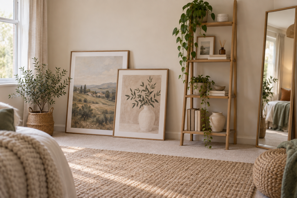
Some walls resist standard solutions, and each type has its own answer.
Very large blank walls need scale, not quantity. A single oversized piece is usually better than twelve small ones, and a large canvas, a tapestry or a substantial mirror will do what a scattered arrangement cannot. If a single large piece is out of budget, a tight grid of nine or twelve identical frames reads as one large object. Another route is to treat the wall architecturally instead, with applied panelling, a colour change, or a full-height shelving unit.
Narrow walls and awkward strips between windows or doors take vertical arrangements: two or three pieces stacked, a narrow mirror, a single tall piece, or a slim shelf. Do not squeeze a wide piece into a narrow space, which looks cramped from every angle.
Sloped ceilings and attic rooms are best handled with leaning rather than hanging, or by keeping art low on the vertical portion of the wall. Trying to hang on the slope itself rarely works.
Textured or difficult surfaces, including brick, concrete, tile and plaster over masonry, need the right fixings. Masonry needs a drill with a masonry bit and appropriate plugs. On brick, drilling into the mortar rather than the brick itself is easier and more easily repaired.
Rentals deserve their own toolkit, because the assumption that nothing can be hung is usually wrong but the damage question is real. Picture ledges and shelves, though they still need fixing, concentrate the damage into a few holes rather than many. Adhesive hanging strips work for lightweight frames on sound, smooth, fully cured paint, though they can lift paint on cheap or newly painted surfaces, so test in a hidden spot first. Leaning is the true no-damage solution: large frames on the floor against the wall, on a console, on a mantel or along a bookshelf. Freestanding options include tension rods, a leaning ladder shelf, a room divider or a clothes rail used as a display. Removable wallpaper and peel-and-stick panelling change a whole wall without a single hole. And small nail holes, honestly, are usually filled and painted at the end of a tenancy without much drama, so check the agreement rather than assuming.
Rooms with almost no wall space, meaning kitchens, small bathrooms and rooms full of windows and doors, should lean on the walls that exist rather than trying to cover everything. One good piece in a kitchen, one in a bathroom, and the job is done. Bathrooms in particular should avoid anything valuable, since humidity damages paper and warps frames, so favour prints you can replace, ceramics, mirrors and anything under glass with a sealed back.
Where Wall Decorating Goes Wrong
The failures repeat across thousands of rooms and each has a specific cause.
Everything hung too high. Measure to 145cm at the centre, and keep the gap above furniture between 15 and 25cm.
Art too small for the wall. Reframe with a wider mat, group pieces together, or move the piece somewhere smaller.
Evenly distributed single items. One small frame on each wall, spaced regularly, reads as an afterthought. Concentrate the wall decorating on one or two walls and let the others be empty.
No breathing room. A room where every wall is covered has nowhere for the eye to rest. Leave at least one substantial wall blank in most rooms, which makes the decorated ones read as deliberate.
Frames that all match the furniture wood. Matching the frame exactly to a wood tone in the room makes both disappear. Contrast reads better than match.
Nothing at eye level. If the only things on the walls are above furniture and near the ceiling, the room feels top-heavy. Something at standing eye level in a hallway or entrance fixes it.
Ignoring what is behind glass. Glare is a real problem on a wall opposite a window. Non-reflective or museum glass solves it, and for inexpensive pieces, removing the glass altogether is a legitimate option that also makes prints look richer.
No lighting. Art on an unlit wall disappears after dark, which is when most people are home. A picture light, a nearby lamp or a directed downlight changes a piece completely.
Buying art to match the sofa. This is the one that produces rooms with nothing in them worth looking at. Art chosen to coordinate with upholstery ends up as coloured wallpaper. Pieces chosen because you actually like them will work in the room, because the room already reflects your taste. If the colours clash slightly, that is usually more interesting than if they match.
Frequently Asked Questions
How high should I hang pictures?
Hang the centre of the piece at 145cm (57 inches) from the floor, which corresponds to average eye level and is the standard used in galleries and museums. When hanging above furniture, keep 15 to 25cm between the top of the furniture and the bottom of the frame instead, since the relationship to the furniture matters more than the absolute height. For a group, treat the whole arrangement as a single rectangle and centre that at 145cm.
What size art should go above a sofa?
Aim for the piece or arrangement to span roughly two thirds to three quarters of the sofa’s width. A three-seat sofa of around 210cm therefore wants art spanning somewhere between 140 and 160cm, whether that is one large piece or several hung as a group. Undersized art above a sofa is the most common wall-decorating error there is, and the visual gap it leaves cannot be fixed by hanging it higher.
How do I hang a gallery wall without making lots of holes?
Plan it fully on the floor first, then cut paper templates for each frame with the hanging point marked, tape them to the wall and adjust until the arrangement is right. Only then drive a nail through each marked point. This turns a gallery wall into exactly one hole per frame. Alternatively, mount one or two picture ledges and lean everything, which concentrates all the fixings into a few points and allows unlimited rearranging afterwards.
What can I hang on walls besides framed pictures?
Mirrors, woven wall hangings and textiles, quilts and rugs, hats, woven baskets in clusters, ceramic or brass plates, architectural salvage such as corbels and old window frames, floating shelves and picture ledges, mounted or trailing plants, sculptural pieces in wood or metal, and wall lighting including sconces and picture lights. Mixing two or three of these categories with framed art gives a room more depth than framed pieces alone.
How do I decorate walls in a rental without damaging them?
Leaning is the only genuinely damage-free method, whether that means large frames resting on the floor, on a console, on a mantel or along a shelf. Beyond that, adhesive hanging strips suit lightweight frames on smooth, fully cured paint, though they should be tested in a hidden spot first since they can lift cheap paint. Freestanding ladder shelves, tension rods and removable wallpaper all change a wall without fixings. And small nail holes are often acceptable, so it is worth checking the tenancy agreement rather than assuming otherwise.
Where can I find affordable wall art?
Charity shops and secondhand markets for frames, which are cheap and can be spray-painted into a matching set. Old books, atlases and botanical plates for framable content. Printing your own photographs large rather than small, which is the cheapest way to get scale. Vintage maps, charts and posters. Fabric offcuts and textile fragments stretched or framed. Art student degree shows and small local markets for original work at modest prices. And framing something you already own, since a generous mat and a good frame transform almost any flat object.
How many pieces should I put on one wall?
There is no fixed number, but the composition matters more than the count. One large piece is often the strongest option on a wall above furniture. Odd numbers generally arrange more naturally than even ones, except in symmetrical pairings such as matched pieces either side of a bed. What matters is that the arrangement fills roughly two thirds to three quarters of the width it relates to, and that it reads as one composition rather than several scattered objects.