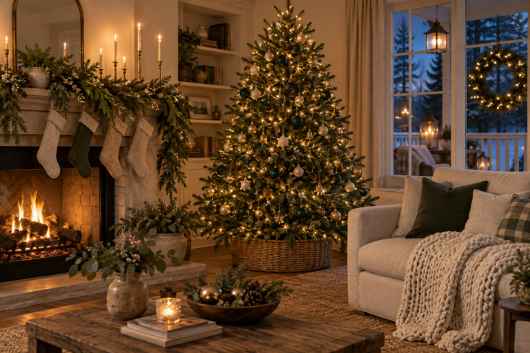
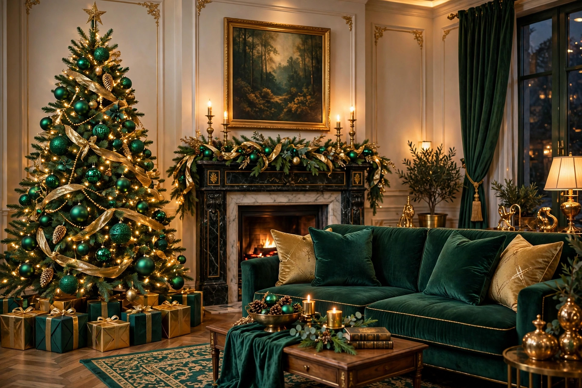
Emerald Green & Gold Christmas Decor
Most Christmas color schemes do not fail because of one bad purchase. They fail because they never committed to being anything — a little red here, some silver there, a gold ornament inherited from who-knows-where, until the tree looks like a committee designed it. The rooms that stop you in your tracks at Christmas all…
Most Christmas color schemes do not fail because of one bad purchase. They fail because they never committed to being anything — a little red here, some silver there, a gold ornament inherited from who-knows-where, until the tree looks like a committee designed it. The rooms that stop you in your tracks at Christmas all share one trait: a palette with conviction.
Right now, the palette with the most conviction is emerald green and gold. It is rich without being heavy, festive without being predictable, and — when balanced correctly — it makes even a modest living room feel like the lobby of a very good hotel. Designers have been circling this combination for several seasons, and for Christmas 2026 it has fully arrived as the defining luxe palette.
This guide is the complete playbook: why emerald and gold works (the color theory in plain English), how to balance two power colors with the 60-30-10 rule, room-by-room styling for the tree, mantel, and table, the textile and lighting choices that make or break the look, the budget moves that deliver the luxe feeling for less, and the common mistakes that turn luxe into gaudy. Direct answers first, specifics throughout.
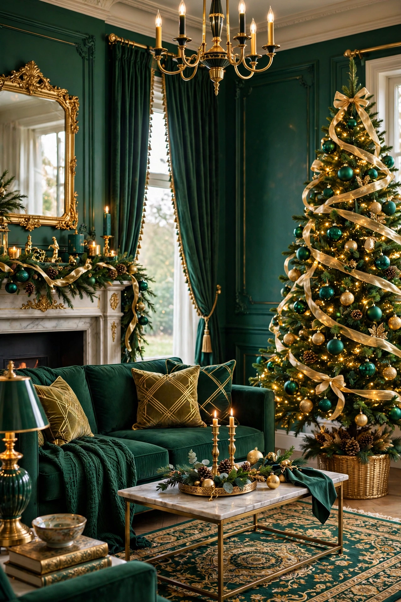
Why Emerald and Gold Owns Christmas 2026
The direct answer: emerald and gold sits at the intersection of three converging trends — the return of rich color after years of neutrals, the appetite for “quiet luxury” in home decor, and Christmas’s perennial need for something that feels special. It satisfies all three at once.
The color theory is straightforward. Emerald is a deep, blue-leaning green — saturated enough to read as a color, dark enough to act almost as a neutral. Gold is a warm metallic that advances visually, catching light and drawing the eye. Together they create exactly the contrast a festive room needs: depth from the green, glow from the gold. It is the same reason the combination has anchored luxury branding, hotel lobbies, and evening wear for a century.
There is also a seasonal logic. Christmas greenery is already green — emerald simply deepens and enriches what is there rather than fighting it. And gold flatters warm interior light in a way silver does not; under 2700K lamplight, gold glows while silver goes flat. The palette works with your home’s existing warmth instead of against it. Even Martha Stewart’s famously regal holiday styling leans on this exact dynamic — deep greens paired with golden metallics for that collected, old-world richness, as Woman & Home’s look at her Christmas decorations shows in detail.
Understanding the Palette: Shades That Work Together
The direct answer: not all greens and golds cooperate. The palette works when you pair a blue-leaning emerald with a warm, muted gold (antique or champagne), and it falls apart when either color drifts — yellow-greens with bright yellow-golds turn brassy and cheap.
The Greens
- Emerald: the anchor. Deep, saturated, slightly blue. Velvet emerald ribbon, emerald glass ornaments, emerald throw pillows.
- Forest/hunter green: the supporting green for natural elements — real garland, wreaths, tree foliage. Slightly darker and more natural than emerald; the two greens layered together create depth.
- Sage or eucalyptus: the softener. A little goes a long way — eucalyptus sprigs in arrangements keep the deep greens from feeling heavy.
The Golds
- Antique gold: the primary metallic. Warm, slightly muted, with a patina feel. Brass candlesticks, antique-gold ornaments, aged gold ribbon.
- Champagne: the lighter metallic for contrast — champagne ornaments and ribbon catch light differently than antique gold and keep the palette from going monotone.
- Polished brass: the accent metallic for small objects — bells, candle holders, picture frames. Use sparingly; too much polished metal tips into glare.
Avoid: yellow-gold (reads as costume jewelry), rose gold (fights the green’s cool undertone), and silver or chrome (kills the warmth the palette depends on). If you want to see how these color relationships play out across broader interior trends, our trending home decor colors guide maps the same warm-metal logic year-round.
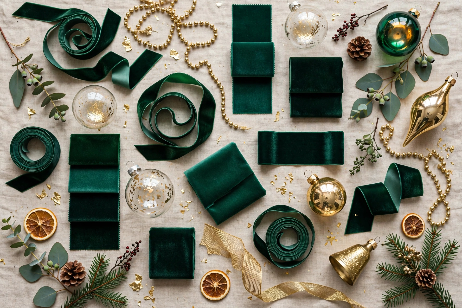
The 60-30-10 Rule for Balancing Two Power Colors
The direct answer: let emerald dominate at 60 percent (greenery, textiles, large ornaments), gold support at 30 percent (metallics, ribbon, lighting accents), and reserve 10 percent for a bridging neutral — warm white, cream, or natural wood. The neutral is what keeps two strong colors from shouting at each other.
Here is how the ratio plays out in a real living room:
- 60% emerald: the tree itself, garland on the mantel, velvet throw pillows, an emerald throw blanket, green glass ornaments (the largest ornaments on the tree should be emerald).
- 30% gold: ribbon on the tree, brass candlesticks, gold ornament accents, a gold-framed mirror or tray, metallic gift wrap.
- 10% neutral: cream knit stockings, warm-white lights, natural wood bead garland, ivory candles. The neutral gives the eye rest and makes both colors look richer by contrast.
The most common failure mode is 50-50: equal emerald and gold fighting for attention with no hierarchy. If your room feels busy, the fix is almost always “more emerald, less gold” — deepen the green foundation and let the gold be the jewelry, not the outfit. Conversely, a room that feels flat usually needs 5 percent more gold in the lighting layer: a brass tray, candlelight, or metallic ribbon catching the lamplight.
The Tree: Emerald and Gold Done Right
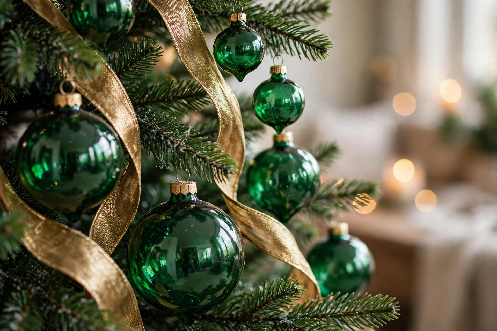
The direct answer: build the tree in layers — warm-white lights first, then emerald ornaments in graduated sizes (largest deep inside the branches), then gold ribbon woven vertically, then metallic accents on the branch tips. The layering order is what creates depth rather than a flat decorated surface.
- Lights: 100 warm-white LEDs per foot of tree height (700 for a 7-foot tree). Warm white only — multicolor lights destroy this palette. Weave lights deep into the branches, not just on the surface.
- Emerald foundation: 20-30 emerald ornaments in mixed finishes (matte, shiny, glitter) and graduated sizes — 4-inch balls tucked deep inside the tree near the trunk, 3-inch in the middle layer, 2-inch on the outer branches. The big-deep/small-outside rule creates the professional depth you see in styled photos.
- Gold ribbon: 2.5-inch wired ribbon in antique gold, woven vertically in 3-4 cascades from top to bottom rather than spiraled horizontally. Vertical ribbon elongates the tree; horizontal ribbon chops it into bands. Tuck the ribbon 3-4 inches into the branches so it weaves rather than sits on top.
- Metallic accents: 12-15 champagne and antique-gold ornaments placed on the outer third of branches where they catch light, plus 6-8 gold picks or sprays (berries, leaves) pushed into the tree for texture.
- Topper: an emerald-and-gold bow (see our bow guide technique) or a gold star. Keep it in the palette — a red topper would be the one wrong note.
Mantels and Garlands in Emerald and Gold
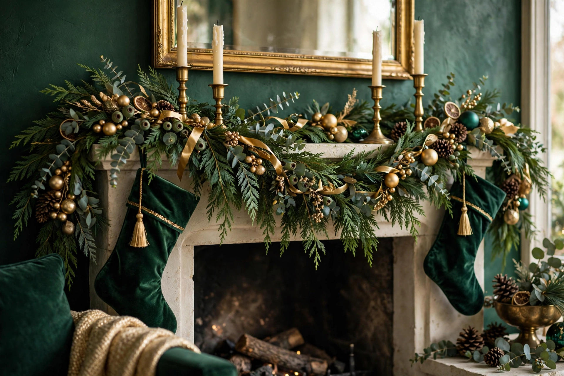
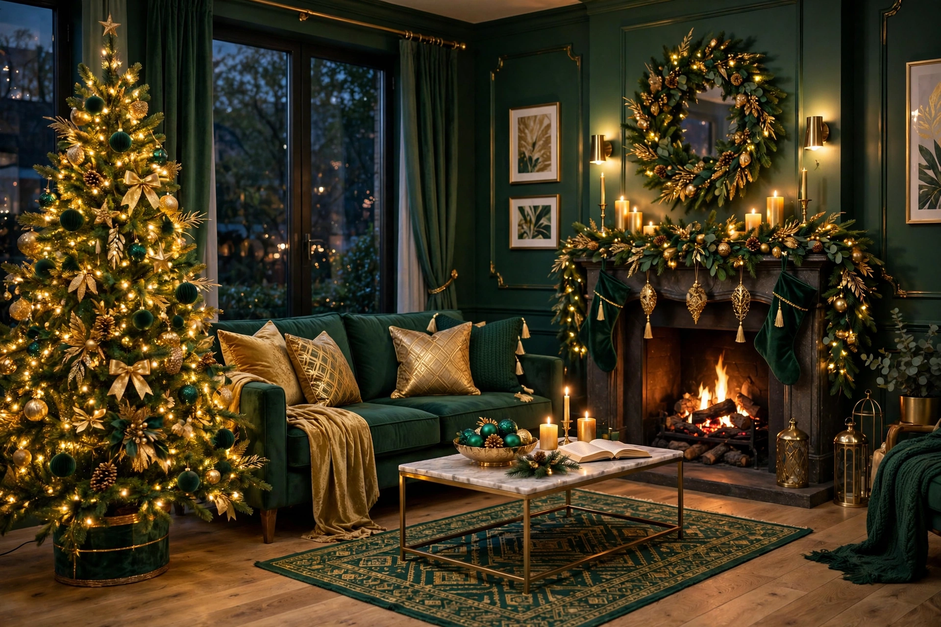
The direct answer: the mantel is where the palette goes lush — layered garland as the emerald base, brass candlesticks as the gold verticals, and one hero element (a mirror, art, or large bow) as the focal point. Symmetry is your friend here; this palette looks best composed, not casual.
Build it in this order:
- Garland base: two 9-foot garlands layered — one cedar or pine, one eucalyptus — for a 6-foot mantel. The mixed foliage gives the depth that single-type garland lacks. Let it drape 8-10 inches over each end.
- Lights: one 20-foot warm-white strand woven through, kept to the back of the garland so the glow comes from within.
- Gold verticals: brass candlesticks in graduated heights (8, 10, 12 inches) grouped in odd numbers at each end or clustered asymmetrically on one side. Taper candles in ivory or deep green.
- Emerald accents: 6-8 emerald ornaments nestled into the garland, plus a wide emerald velvet bow at the center or at each swag point.
- The hero: a round gold mirror, a piece of art, or a large wreath hung above the mantel, centered. This is the focal point everything else frames.
No mantel? The same composition works on a console table, a bookshelf top, or a sideboard — the formula (green base + gold verticals + hero focal point) is portable to any horizontal surface.
The Table: Holiday Tablescapes in the Palette
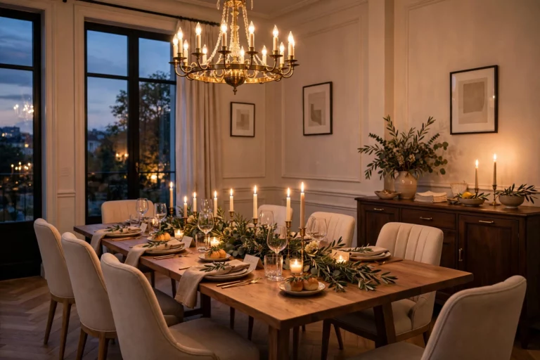
The direct answer: an emerald-and-gold table needs three layers — a textile foundation, a low green centerpiece, and gold accents at each place setting. Keep the centerpiece under 12 inches tall so guests can see each other; the palette provides the drama, not the height.
- Foundation: an emerald table runner (velvet if you have it, linen if not) over a neutral tablecloth, or a bare wood table with the runner alone. Chargers in gold or brass-tone set the metallic note at each seat.
- Centerpiece: a low garland runner down the table’s center — eucalyptus and cedar mixed — studded with brass candlesticks of varying heights and a few emerald ornaments. Add unscented ivory taper candles; scented candles compete with food.
- Place settings: cream or white plates, gold flatware if you have it (or gold-toned napkin rings as the affordable version), and napkins tied with thin gold ribbon with a sprig of rosemary tucked in.
- Glassware: emerald-tinted water glasses are the secret weapon — one per setting, about $4-6 each at discount retailers, and they do more for the palette than any other single purchase.
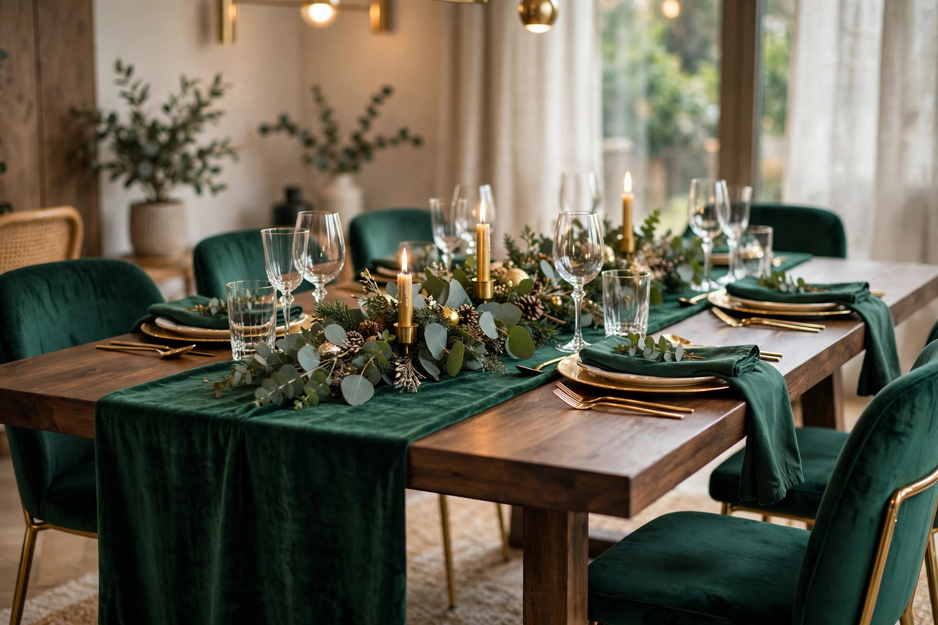
The table is also where the 10 percent neutral does its hardest work — cream plates, ivory candles, and natural linen napkins keep the deep green and gold from overwhelming a surface everyone stares at for two hours. If the full tablescape feels like a lot, our luxury home decor guide breaks down the same “rich but restrained” principles for everyday styling.
Textiles: Velvet Is the Palette’s Best Friend
The direct answer: emerald and gold needs at least one plush texture to avoid looking flat and metallic — velvet is the ideal choice because it absorbs light in a way that makes the gold elements glow brighter by contrast. Three velvet touches per room is the sweet spot.
- Throw pillows: two emerald velvet pillow covers on the sofa (covers, not new pillows — $12-18 each). Mix one solid emerald with one subtly patterned (a tone-on-tone damask or stripe) for depth.
- A throw blanket: draped over the sofa arm or a chair — emerald velvet or a chunky cream knit for the neutral 10 percent.
- Ribbon: emerald velvet wired ribbon is the single most useful textile in this palette — tree cascades, wreath bows, gift wrap, napkin ties.
- Tree skirt or collar: an emerald velvet tree skirt grounds the tree and hides the stand; a brass or gold collar works if you prefer metal at the base.
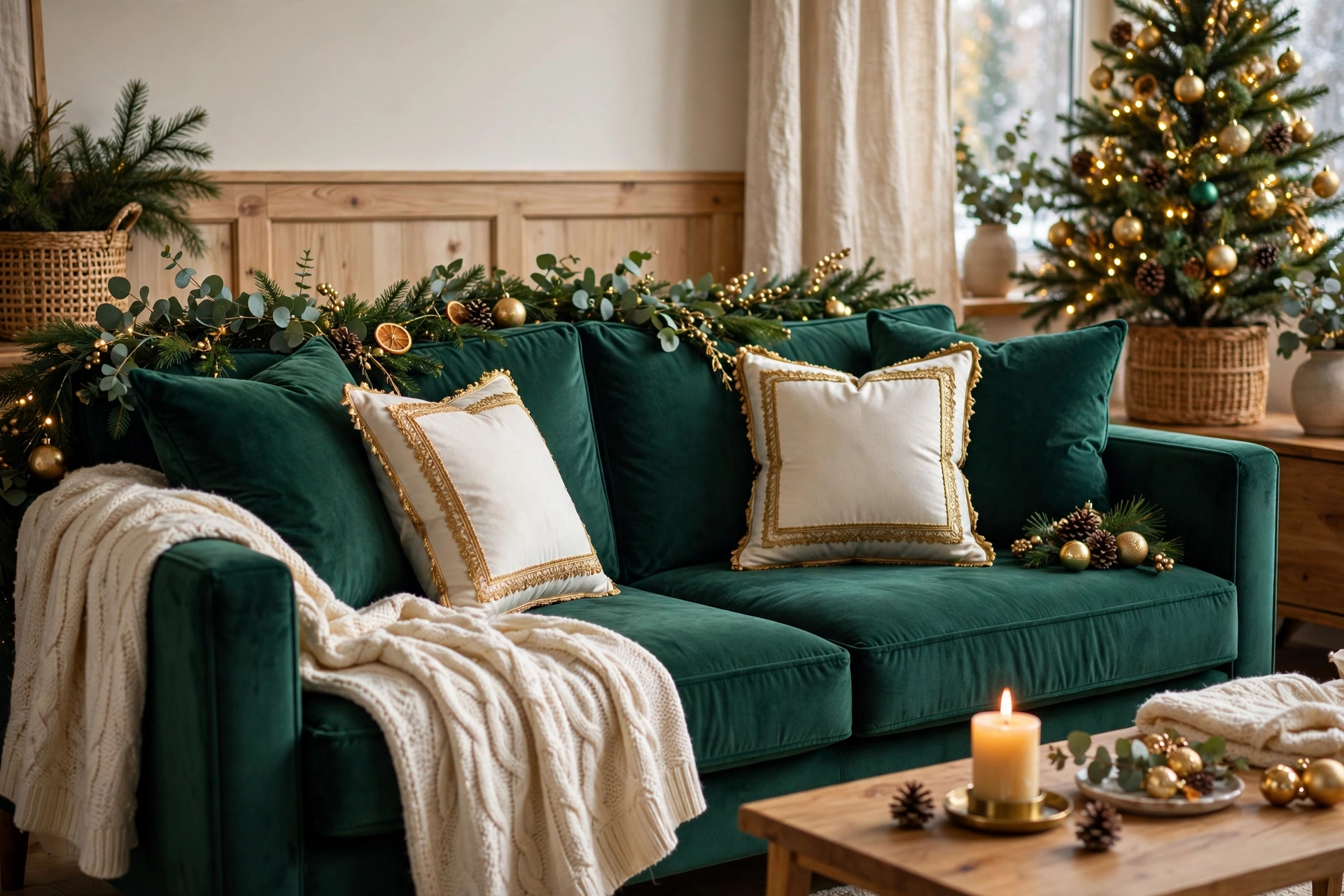
Balance the velvet with one contrasting texture per room so it does not go monotonous — nubby linen, natural wood, or woven rattan all work. The contrast texture should live in the neutral 10 percent: a jute rug under the tree, linen napkins on the table, a wooden bead garland on the mantel.
Lighting: Warm Light Is Non-Negotiable
The direct answer: this palette lives or dies on light temperature. Every bulb should be warm white (2700-3000K) — cool or daylight bulbs turn emerald muddy and gold brassy. When in doubt, go warmer and dimmer rather than brighter.
Layer three light sources in the main room:
- Tree lights: warm-white LEDs, 100 per foot of height, on a timer for dusk. These are the primary glow source.
- Candlelight: real tapers in brass holders on the mantel and table, plus flameless LED candles inside lanterns elsewhere. Candlelight is the most flattering light for metallics — it makes gold shimmer in a way no bulb replicates.
- Ambient lamps: table and floor lamps with warm bulbs and fabric shades, dimmed if possible. Overhead ceiling lights should stay off in the evening; they flatten everything.
One warning: avoid colored or “twinkle” light settings on the tree. The palette’s power is its coherence, and a single strand of chasing multicolor LEDs unravels it instantly. Save the playful lights for another room or another year.
Small Touches That Tie Rooms Together
The direct answer: repeat three small elements — one emerald, one gold, one scent — in every decorated room, and the whole house reads as one composed scheme rather than a collection of decorated spots.
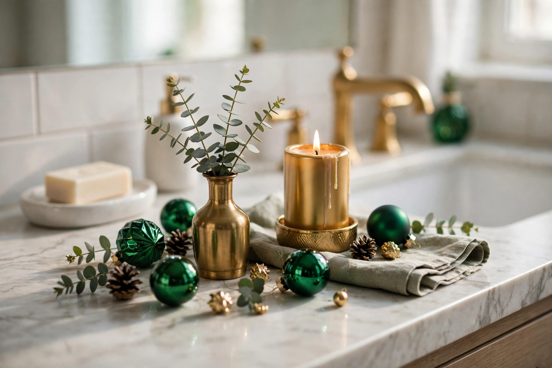
- Emerald echo: a small sprig of eucalyptus or a single emerald ornament in a bowl on the coffee table, the entryway console, and the bathroom counter.
- Gold echo: a brass bell on the doorknob, gold ribbon on the banister, a small brass tray corralling candles on the side table.
- Scent echo: a simmer pot (orange slices, cinnamon sticks, cloves, a sprig of pine) or a fir-and-cedar candle. Scent is the invisible thread — guests will feel the cohesion without knowing why.
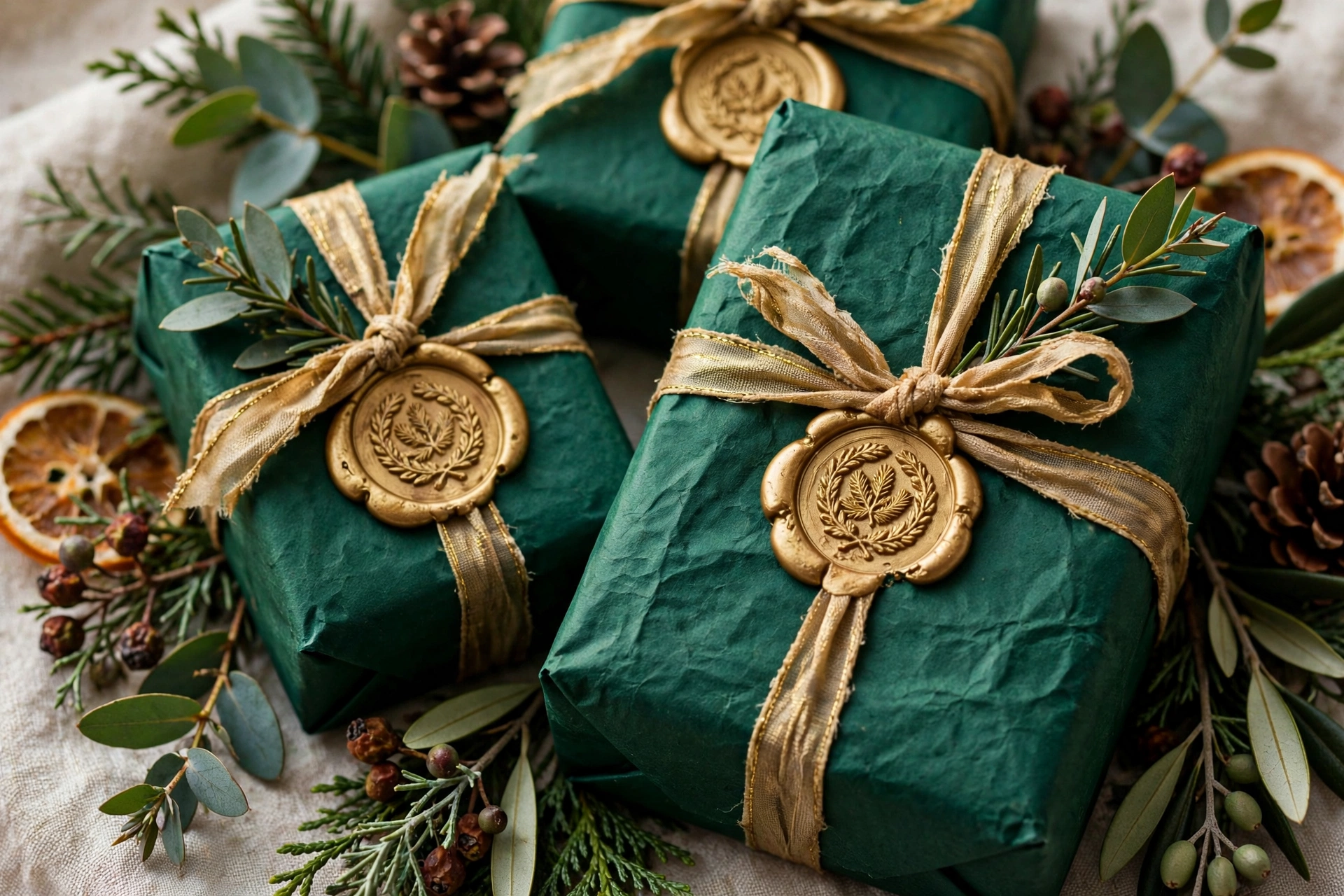
- Gift wrap: wrap all visible gifts in the palette — emerald paper with gold ribbon, or kraft paper with emerald velvet ribbon. The pile under the tree is part of the room’s color story.
What to Avoid: 6 Mistakes That Turn Luxe Into Gaudy
The direct answer: the line between luxe and gaudy in this palette is discipline — too many metallics, mixed metal tones, and cool lighting are the three killers. Here are the six mistakes I see most:
- Mixing gold with silver: pick one metal family per room. Silver ornaments on an emerald-and-gold tree read as indecision, not eclecticism.
- Too much shine: if every ornament is metallic, nothing shines. The 60-30-10 rule exists for this — matte and velvet finishes must outnumber metallics.
- Cool-white lights: covered above, but worth repeating — cool light is the fastest way to make this palette look cheap.
- Yellow-green drift: lime or chartreuse accents (often sneaked in by “gold” tinsel that is really yellow) clash with emerald’s blue undertone. Check tinsel and ribbon in natural daylight before committing.
- Ignoring the neutral: a room with zero cream, white, or wood looks like a jewelry box — impressive for ten seconds, exhausting for an evening. The neutral 10 percent is structural, not optional.
- Over-decorating: this palette’s richness means you need fewer pieces, not more. A tree with 40 well-chosen ornaments in emerald and gold looks more expensive than one with 120 mixed ornaments. Restraint is the luxury.
Emerald and Gold Beyond the Living Room
The direct answer: carry the palette through the house with one signature moment per room — a wreath variation at the entry, a garland runner in the kitchen, a textile swap in the bedroom. Three rooms, three moments, one coherent home.
The Entryway: First Impressions in Two Colors
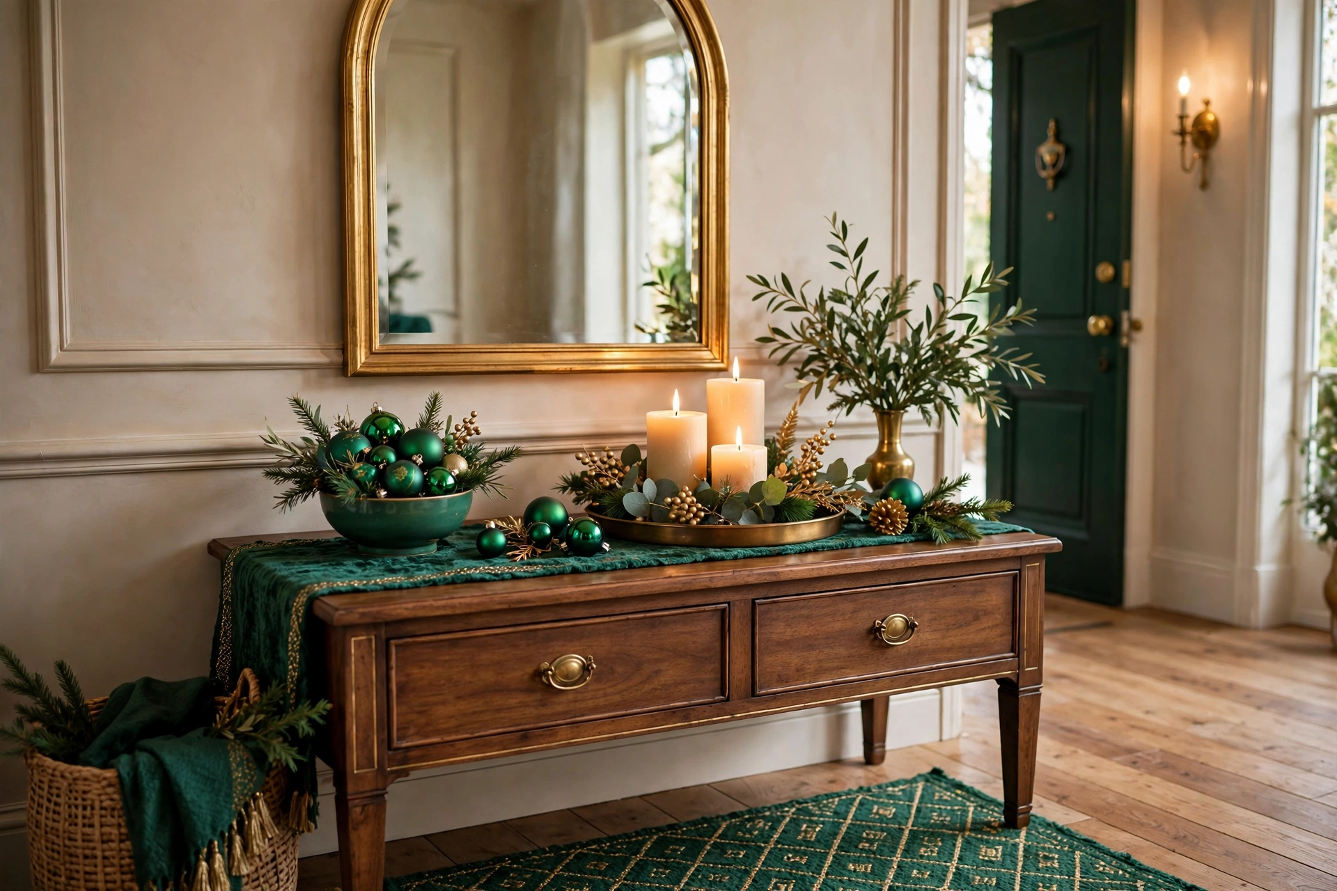
The entry sets the palette’s promise. Hang a 24-inch wreath on the front door built on an emerald base — boxwood or preserved cedar — with antique-gold ribbon woven through and a large velvet bow at the bottom. Inside, style the console table with the small-touch formula: a brass tray, two ivory taper candles in brass holders, and a small bowl of emerald ornaments. Add a coir doormat layered over a slightly larger flat-weave rug in deep green — the layered-mat look is a designer staple and it frames the doorway in the palette before guests even step inside.
The Kitchen: The Hardest-Working Room
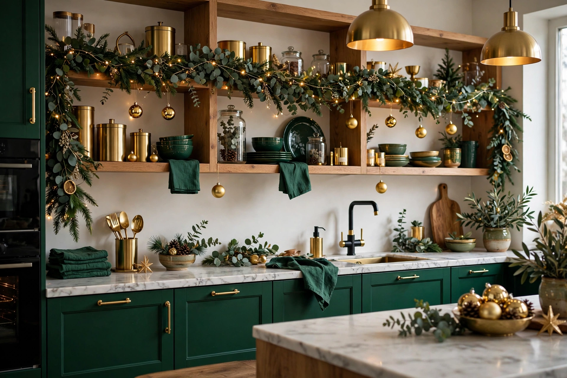
Kitchens get the lighter version of the palette because they need to stay functional. Run a slim eucalyptus garland along the top of open shelving or across the range hood, weave in warm-white fairy lights, and hang three gold ornaments at staggered lengths from the hood with thin ribbon. Swap the everyday tea towel for a deep green one, and put a small brass bowl of clementines on the counter — the orange-gold fruit against green foliage is a still life that happens to be edible. Keep all decor at least 12 inches from the stovetop and never hang anything above active burners.
The Bedroom: Restful, Not Showroom
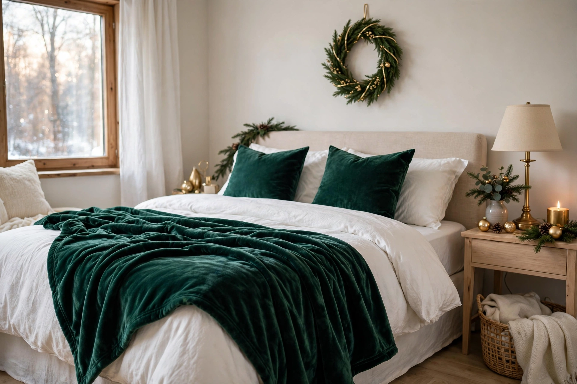
The bedroom gets the palette at half volume. Swap in emerald velvet pillow shams or a folded throw across the foot of the bed, hang a small 12-inch wreath above the headboard with a thin gold ribbon, and put a single brass candlestick with an ivory taper on the nightstand (flameless if you read in bed). That is the whole scheme — the bedroom should whisper the palette, not announce it. You will see it last thing at night and first thing in the morning, which makes it the most personally rewarding room to decorate.
Shopping the Palette: What to Buy vs. What to DIY
The direct answer: buy the things where finish quality matters (velvet ribbon, glass ornaments, brass candlesticks) and DIY the things where abundance matters more than perfection (garland enhancement, gift wrap, painted accents). This split gets you the luxe look at roughly half the all-bought cost.
Worth Buying
- Wired velvet ribbon in emerald: $8-14 per 10-yard spool. Cheap velvet looks like felt; the pile depth of good velvet is visible across a room. This is the palette’s workhorse — do not economize here.
- Glass ornaments in emerald and antique gold: $15-25 for a set of 12-16. Glass reflects light in a way plastic cannot, and in a palette built on glow, that matters.
- Brass candlesticks: thrifted brass ($3-8 each at flea markets) beats new “gold-tone” metal every time. Real brass has weight and patina that reads as authentic.
- Emerald-tinted glassware: $4-6 per glass. The single highest-impact table purchase in this guide.
Worth DIYing
- Garland enhancement: buy one basic $15 pine garland and bulk it up with $8 of eucalyptus stems and pinecones from a craft store. The result looks like a $60 custom garland.
- Painted accents: a $6 can of antique-gold spray paint transforms thrifted frames, old ornaments, and pinecones. Prep with a light sanding and two thin coats — thick coats look cheap.
- Gift wrap: kraft paper ($5 a roll) plus emerald velvet ribbon and a gold paint pen for monograms looks more expensive than any printed holiday paper.
- Wreath base: a $10 grapevine wreath form plus foraged or craft-store greenery wired in yourself costs a third of a pre-made equivalent and looks better.
Total realistic budget for a full living-room-plus-table scheme: $120-180 buying smart, $60-100 with heavy DIY and thrifting. The palette’s secret is that color discipline does the luxury work — a $6 spool of the right ribbon outperforms a $40 box of the wrong ornaments every time.
Making It Timeless, Not Trendy
The direct answer: emerald and gold outlasts trend cycles when you invest in the permanent pieces (brass, velvet ribbon, glass ornaments) and treat only the fresh greenery as seasonal. Buy once, reuse for a decade, refresh with $20 of new ribbon when you want a change.
The reason this palette survives while trend palettes fade is that it is not really a Christmas invention — it is a classic luxury combination that Christmas borrows. Deep green and gold has anchored formal dining rooms, libraries, and hotel lobbies for generations. When the 2026 trend reports move on to whatever comes next, your brass candlesticks and emerald velvet ribbon will still look correct, because they were never really about 2026.
Build your collection with that horizon in mind. Each year, add two or three permanent pieces — a set of brass candlesticks one year, emerald glass ornaments the next, a good velvet tree skirt the year after. In five years you own the palette outright, and decorating becomes assembly rather than shopping. The fresh elements (garland, eucalyptus, the simmer pot) cost $25-40 a season and provide the “new” feeling that keeps the tradition from going stale. Timeless is not the opposite of fresh — it is the foundation that makes fresh affordable.
Frequently Asked Questions
1. What colors go with emerald green for Christmas?
Gold is the classic partner — specifically antique gold and champagne, which share emerald’s warmth. Cream, ivory, and natural wood act as bridging neutrals. Avoid silver (kills the warmth), rose gold (clashes with emerald’s cool undertone), and yellow-greens (turn brassy next to true emerald).
2. How do you balance emerald green and gold without it looking gaudy?
Use the 60-30-10 rule: 60 percent emerald (greenery, textiles, large ornaments), 30 percent gold (metallics, ribbon, accents), 10 percent warm neutral (cream, wood). Keep metallics outnumbered by matte and velvet finishes, use warm-white lighting only, and remember that restraint reads as luxury — fewer, better pieces beat abundance here.
3. Can I do emerald and gold Christmas on a budget?
Yes — the palette is about color discipline, not expensive pieces. Spray-paint thrifted ornaments antique gold ($6 for a can that covers 30 ornaments), buy emerald velvet ribbon instead of emerald ornaments (ribbon covers more visual area per dollar), and let real greenery provide the emerald foundation for free. A convincing scheme costs $60-100, and most of it — the ribbon, the brass, the glass — gets reused for years, so the real annual cost drops fast.
4. Does emerald and gold work in a small apartment?
Beautifully — deep colors make small rooms feel intentional and jewel-box-like rather than cramped. Concentrate the palette in one main zone (a tabletop tree, a dressed shelf, a tablescape) rather than spreading it thin. Our Christmas home decorating ideas guide has scaling strategies that pair well with a strong palette.
5. What kind of Christmas lights work with emerald and gold?
Warm-white LEDs only, at 2700-3000K — 100 lights per foot of tree height. Cool-white or daylight bulbs turn emerald muddy and gold brassy. Avoid multicolor, twinkle, and chasing settings; the palette’s power is coherence, and novelty light modes unravel it.
6. What is the difference between antique gold and regular gold decor?
Antique gold has a muted, slightly darkened patina — warm but not bright — while standard “gold” decor is often a bright yellow-gold that reads as brassy next to emerald. For this palette, always choose antique, champagne, or brushed gold finishes. If you already own bright-gold pieces, layering them deep inside the tree (where light is dimmer) mutes them naturally.
7. How do I decorate a mantel in emerald and gold?
Layer two garlands (cedar/pine plus eucalyptus) as the emerald base, weave in one warm-white light strand, add brass candlesticks in graduated heights as gold verticals, nest emerald ornaments into the greenery, and center a hero element (gold mirror, art, or large wreath) above. Keep the composition symmetrical — this palette looks best composed.
8. Can I mix emerald and gold with my existing red Christmas decor?
A little red goes a long way here. If you must include heirloom red pieces, confine them to one zone (the tree’s interior, or a single wreath) and keep them deep — burgundy and oxblood bridge to emerald far better than bright cherry red. Honestly, though, the palette is strongest pure; consider giving red the year off.
9. What tree topper works with emerald and gold?
An emerald-and-gold bow made from wired velvet ribbon, or a gold star in an antique (not bright) finish. The topper should be the palette’s exclamation point — 10-14 inches wide on a 7-foot tree. Avoid red toppers, novelty toppers, and anything silver; one off-palette element at the highest visual point undermines the whole tree.
10. How do I store emerald and gold decor so the metallics do not tarnish?
Wrap gold and brass pieces individually in acid-free tissue (not newspaper — the ink transfers), store in a climate-controlled space since humidity accelerates tarnishing, and add silica gel packets to ornament boxes. Polish brass candlesticks once before packing away; clean metal stored dirty tarnishes faster.
Emerald and gold endures because it is not really a trend — it is a formula. Deep color plus warm metal plus candlelight has looked luxurious for a century, and it will look luxurious long after the trend reports move on. Commit to the palette, respect the ratio, keep the light warm, and your Christmas will have the quiet confidence of a room that never had to try too hard. Start with the ribbon and the lights — the two cheapest elements with the biggest impact — and let the rest of the palette build itself around them.