Home Decor Ideas: The Ultimate Guide to Decorating Your House
A room rarely goes wrong because of one bad cushion. It goes wrong much earlier, usually at the moment someone orders a sofa before noticing that the only window faces north, or paints all four walls before living in the space through a single change of season. Decorating is mostly sequencing. Get the order right and the expensive decisions become obvious. Get it backwards and you spend months buying accessories to patch over a layout that was never going to work.
This guide walks through that order the way an experienced decorator would: what the room has to do, what colour it wants to be, how it gets lit, where the furniture sits, and only then the layers that make it feel like yours. Along the way there are the actual measurements worth memorising, the mistakes that cost the most money, and ideas broken down room by room for people working with a rental, a tight budget, or a house that has been half-decorated for three years.
Decide What the Room Needs to Do Before You Buy Anything
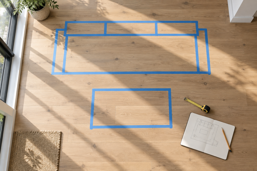
Before choosing anything visual, write down how the room is genuinely used on an ordinary Tuesday, not how you imagine using it. List the activities, the number of people, and the times of day. Then measure the room and mark the doors, windows, radiators and sockets. Every later decision, from rug size to lamp placement, follows from that one page.
The gap between the imagined room and the real one is where most decorating budgets disappear. A formal dining room in a house where everyone eats at the kitchen island becomes storage. A pale linen armchair in a home with a shedding dog becomes a source of low-grade resentment. Be honest first, aspirational second.
Once you have the use list, walk the room and notice the traffic paths. People move through a space along fairly predictable lines: door to sofa, door to window, sofa to kitchen. Those paths need roughly 30 to 36 inches of clear width in main routes, and around 24 inches in tighter secondary ones. Furniture that blocks a natural path will be shoved out of line within a week, no matter how good it looks in the plan.
Next, identify the focal point. Every room has one, whether you choose it or not. It might be a fireplace, a big window with a decent view, a bed, or a built-in alcove. If the room genuinely has no architectural focus, you create one: a large piece of art, a bold headboard, a painted chimney breast, a substantial bookcase. Rooms without a focal point feel restless because the eye has nowhere to land.
Before committing to anything large, map it out physically. Painter’s tape on the floor showing the footprint of a sofa or dining table takes fifteen minutes and prevents the single most common furniture mistake, which is buying something a size too big. Cardboard cut to the depth of a chest of drawers, propped against the wall, tells you more than any online dimension list.
Finally, live with the room for a few weeks if you can. Light changes dramatically between January and June, and a wall that looks warm grey in autumn can read cold blue in spring. Knowing how the light moves through a space at 8am, 2pm and 7pm is genuinely useful information that no mood board can give you.
Building a Colour Palette That Holds Up Over Time
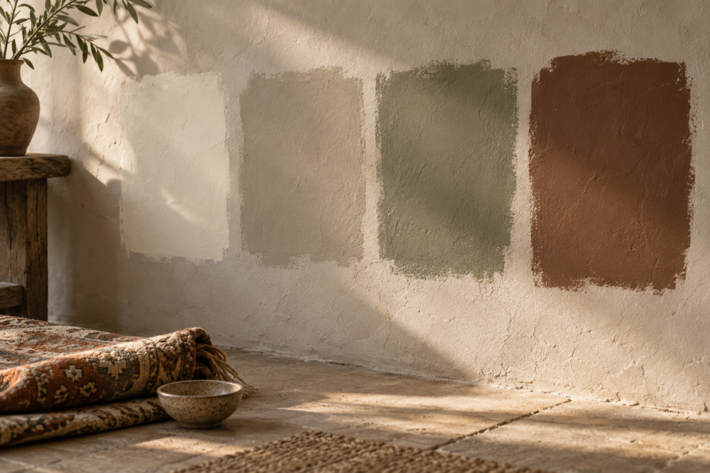
A reliable starting formula is to divide a room’s colour roughly into 60 percent dominant shade, usually walls and large surfaces, 30 percent secondary, usually upholstery and curtains, and 10 percent accent, meaning cushions, art and small objects. Choose the palette from one existing item you already love, then test paint on the actual wall before committing.
That last point matters more than anything else in this section. Paint behaves differently in every room. North-facing rooms receive cool, steady light that pushes greys towards blue and makes some whites look grubby. South-facing rooms get warm light that flatters almost everything. East-facing rooms are bright in the morning and flat by evening; west-facing rooms do the opposite. A shade that looks perfect in a showroom can look entirely wrong on your wall by teatime.
Test properly. Paint sample patches at least A4 size, ideally larger, on two different walls, and leave them for two or three days. Look at them in morning light, in afternoon light, and under your lamps at night. If you can, paint the samples onto white card and move the card around the room instead of painting directly, so the old wall colour underneath does not distort what you are seeing.
Undertones are the quiet reason schemes go wrong. Two greys that look identical on a chart can have a green undertone and a violet undertone, and next to each other they will look faintly dirty. Hold your samples against something pure white, like printer paper, and the undertone becomes obvious immediately. Keep undertones consistent across a room and, ideally, across the connected areas of the house.
How Do I Choose Colours If I’m Starting From Nothing?
Start from a patterned object rather than a paint chip. A rug, a length of fabric, a favourite piece of art or even a ceramic bowl already contains a palette that a designer has balanced. Pull three to five shades from it: one light neutral for walls, one mid-tone for larger soft furnishings, one deeper anchor, and one or two accents. This shortcut works because the hard part of colour is proportion and harmony, and a well-designed textile has already solved both.
Think about flow between rooms too. In an open-plan space or a narrow hallway that touches several doorways, the eye sees two or three rooms at once. A shared neutral running through hallways and landings, with each room varying its accents, keeps a house feeling coherent without making every room identical. Ceilings and trim in a single consistent shade across the whole floor also does a lot of invisible work.
Sheen deserves a mention because it changes colour perception. Flat and matte finishes absorb light and hide wall imperfections, which suits ceilings and low-traffic walls. Eggshell and satin wipe clean and suit hallways, kitchens and children’s rooms. Semi-gloss and gloss belong on woodwork, doors and skirting, where durability matters and a slight sheen defines the architecture.
And the persistent myth that dark colours shrink a room is only half true. Dark shades blur the edges of a space, which can make a small room feel enveloping and larger rather than boxed in, particularly in rooms already short on natural light such as a snug, a study or a windowless cloakroom. What actually makes a room feel small is high contrast between walls, ceiling and trim, because the eye reads every boundary.
Lighting Is the Upgrade Most People Skip

Good lighting comes in three layers used together: ambient light that fills the room, task light aimed at a specific activity, and accent light that adds depth and shadow. Aim for at least three separate light sources in any main room, on more than one switch, and put the brightest of them on a dimmer. This single change transforms a room more cheaply than new furniture.
A single ceiling pendant in the middle of the room, which is what most houses arrive with, produces flat overhead light that drains colour out of everything and casts unflattering shadows. It is the lighting equivalent of a supermarket aisle. The fix is not brighter bulbs; it is more sources at different heights.
Ambient light is the base layer: a pendant, ceiling spots, or a large uplighter. Task light does a job: a reading lamp beside the armchair, under-cabinet strips lighting the worktop where you actually chop, a bedside lamp positioned so you can read without waking the person next to you, a desk lamp that hits the page and not the screen. Accent light creates atmosphere: a small lamp on a bookshelf, a picture light, a candle cluster, a table lamp on a hallway console.
Bulb choice matters as much as fixture choice. For living spaces and bedrooms, warm white in the region of 2700K reads cosy and flattering; 3000K is slightly crisper and suits kitchens and bathrooms. Anything cooler starts to feel clinical in a home. Look for a high colour rendering index, ideally 90 or above, because low-quality bulbs make fabrics and skin tones look dull regardless of how carefully you chose your paint.
Keep colour temperature consistent within a single room. Mixing a cool bulb in the ceiling with warm lamps below is one of those errors that nobody can name but everybody notices, because the room looks subtly off in every photograph.
Heights have conventions worth following. A dining pendant usually hangs so its base sits roughly 30 to 36 inches above the table surface, low enough to feel intimate and high enough to see across. A table lamp beside a sofa works best when the bottom of the shade sits near eye level for a seated person, so the bulb is hidden and the light spills onto your book rather than into your eyes. Bedside lamps follow the same logic, measured from a sitting-up position.
Do not forget daylight as a design element. Heavy, dark curtains on a small window swallow the light you have. Hanging a rod 4 to 6 inches above the window frame and extending it 8 to 12 inches past each side lets the curtains stack against the wall instead of the glass, which makes both the window and the room look bigger. Mirrors positioned opposite or perpendicular to a window bounce that light further into the space.
Furniture Scale and Layout: The Measurements That Matter
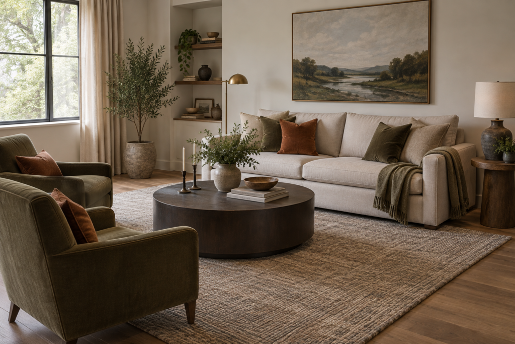
Most layout problems are scale problems. Rugs that are too small, coffee tables too far from the sofa, art hung too high and furniture pushed flat against every wall are the four errors that appear in almost every struggling room. All four have straightforward fixes, and none of them require buying anything new in every case.
Rug size first, because this is the one that changes a room most. In a living room, the rug should be large enough that at least the front legs of every major seating piece sit on it. A rug floating in the middle with all furniture marooned around it makes the whole arrangement look like it shrank in the wash. For an average living room, that usually means stepping up to an 8 by 10 foot rug rather than the 5 by 8 most people instinctively buy. Under a dining table, the rug needs to extend roughly 24 to 30 inches beyond the table edge on all sides so chairs stay on it when pulled out.
Coffee tables work best about 14 to 18 inches from the sofa, close enough to reach a mug without leaning, with a height at or just below the seat cushion. Side tables should land near armrest height. Console tables behind a sofa sit just under the back rail. These conventions exist because they match how bodies actually move, not because of fashion.
Art is hung too high in roughly nine out of ten homes. The reliable rule is to position the centre of the piece, or the centre of a group treated as one piece, around 57 to 60 inches from the floor, which is average eye level. Above a sofa or console, close that gap: leave roughly 6 to 10 inches between the top of the furniture and the bottom of the frame so the two read as a connected arrangement rather than two unrelated events. Artwork above a sofa generally looks best at around two thirds the width of the sofa.
Pull furniture away from the walls where the room allows it. Even 4 to 6 inches of breathing space behind a sofa makes a room feel deliberately arranged rather than cleared for a party. In larger rooms, floating a sofa to create a conversation zone is what separates a designed space from a waiting area. Seating that faces seating, roughly 7 to 9 feet apart at most, is what makes a room feel sociable.
How Do I Lay Out a Small Living Room So It Doesn’t Feel Cramped?
In a small room, fewer and larger pieces beat many small ones. One properly sized sofa reads calmer than a small sofa plus two mismatched chairs plus three occasional tables. Choose furniture on legs rather than solid bases so light and floor are visible underneath, which tricks the eye into reading more space. Use a round coffee table or ottoman to ease circulation past tight corners. Hang curtains near the ceiling to draw the eye up. Keep the largest pattern in the room on one surface only, and let everything else stay quiet. And resist the instinct to line every wall with furniture; a small room with one clear diagonal path through it feels far better than one that is symmetrically full.
Vary heights when you arrange a room. If everything sits at roughly the same level, the space feels flat. Tall bookcases, a floor lamp, a hanging plant, a leaning mirror, a low bench: the difference in vertical rhythm is what makes a room feel three-dimensional. In rooms with high ceilings, taking shelving or curtains most of the way up uses the volume you are already paying for.
The Layers That Make a Room Look Finished
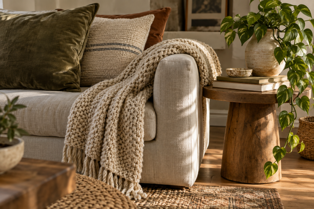
If a room is furnished but still feels like a showroom, texture is usually what is missing. A finished space contains several different surfaces doing different things: something woven, something soft, something with grain, something with sheen, something living. That mix is what reads as warmth, and it matters more than matching.
Think in materials rather than colours for a moment. A boucle or linen sofa, a jute or wool rug, an oak or walnut table, a ceramic lamp base, a glass vase, a brass handle, a stack of paper books. Even in a strictly neutral scheme, that combination gives the eye something to do. Rooms styled entirely in one material, all glossy or all soft, tend to feel either cold or heavy.
Textiles do the heaviest lifting and are also the easiest thing to change seasonally. In the colder months, swap in wool throws, heavier curtains, a sheepskin over a chair arm, and cushions in velvet or chunky knits. From late spring, lighten everything: washed linen, cotton, lighter weaves, a flatweave layered over a heavier rug. This one rotation makes a house feel responsive to the year without repainting anything, and storing the off-season set keeps both halves feeling fresh.
Cushions look best in odd numbers with varied sizes rather than matched pairs across a whole sofa. A practical combination on a three-seater is two larger cushions at the outer corners, two mid-size in a contrasting texture, and one smaller lumbar or patterned cushion off centre. Make sure the inner pads are slightly larger than the covers, because a limp cushion undoes the effect entirely.
Gallery walls fail when they are planned on the wall. Lay the frames out on the floor first and shuffle them until the arrangement balances, then cut paper templates the size of each frame and tape them up to test the composition and the hanging heights before a single nail goes in. Keep gaps consistent, around 2 to 3 inches between frames, and treat the whole cluster as one large rectangle whose centre sits at eye level.
Surfaces need editing as much as filling. Grouping objects in threes, varying heights, and using a tray or a stack of books to corral small things is the difference between styled and cluttered. Leave at least a third of any surface empty. Deal with visible cables, because nothing undermines a carefully layered room faster than a nest of white wires behind a lamp.
Which Plants Actually Survive in a Room With Poor Light?
Pothos, snake plant, ZZ plant, cast iron plant and most philodendrons tolerate low and indirect light genuinely well, which is why they appear in almost every north-facing flat that still looks alive. Ferns and calatheas prefer the humidity of a bathroom or kitchen. Fiddle leaf figs and most succulents need considerably more light than people expect and are a poor choice for a dim corner. Match the plant to the light you actually have, use pots with drainage, and remember that overwatering kills far more houseplants than neglect. Three healthy plants at different heights, one on the floor, one on a shelf, one trailing, do more for a room than a dozen struggling ones.
Scent and sound belong in this layer too, even though no one photographs them. A room that smells faintly of coffee, cedar or fresh laundry and has something soft underfoot to absorb echo simply feels more inhabited than one that does not.
Room-by-Room Ideas, Plus Where to Spend and Where to Save
The principles above apply everywhere, but each room has its own pressure points. Working through the house in order of how much time you spend in each space, rather than in order of what visitors see, tends to produce a home you actually enjoy.
Living Room
Anchor the room with the largest rug the space will take, then arrange seating around the focal point rather than around the television. If the television is unavoidable as the focus, mount it at seated eye level and break up the black rectangle by building it into a run of shelving or framing it with art. Add a floor lamp beside the main seat, a side table within reach of every seat, and somewhere to put down a drink that is not the floor.
Bedroom
Bedrooms benefit from restraint. Keep the palette soft and the contrast low, invest in proper window coverings, and treat the bed as the focal point with a headboard, generous bedding and matching bedside lighting on both sides. Hang curtains high and wide. Resist the urge to fill the remaining wall space; empty wall in a bedroom reads as calm rather than unfinished.
Kitchen and Dining
Kitchens are decorated mostly through lighting, texture and editing. Under-cabinet task lighting, a run of open shelving with things you use daily, a runner to soften a hard floor, and a small cluster of living things on the windowsill do more than any decorative object. In dining areas, the pendant height and the rug size are the two details that make the space feel intentional.
Entryway and Hallway
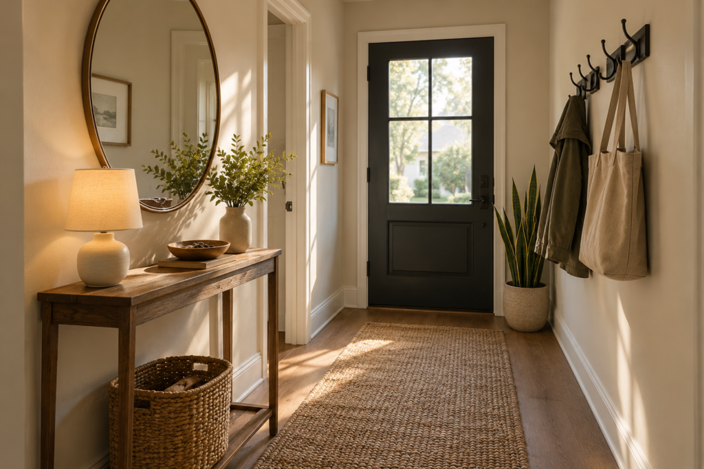
The entry sets the tone for the whole house and is usually the smallest investment. A mirror, a light source that is not the ceiling, somewhere to drop keys, hooks at a usable height and a runner that can take wet shoes will cover almost every hallway. Narrow console tables exist precisely for this space.
Bathroom
Treat bathrooms like small rooms rather than utilitarian ones. Thick towels in a coherent colour, a plant that likes humidity, a framed print on the wall, a warm bulb instead of a cool one, and decanted bottles instead of branded plastic will change the feel of the room in an afternoon.
Renting Without Painting or Drilling
Renters are not limited to cushions. Peel-and-stick wallpaper on one wall or inside an alcove, removable adhesive hooks rated for the weight, large leaning mirrors and leaning art, freestanding shelving, tension rods for curtains, and rugs layered over unloved flooring all reverse cleanly. Replacing lampshades and light bulbs, and adding plug-in wall lights where there are no wired fittings, deals with most rental lighting problems without touching the electrics. Keep the originals in a box and put them back on the way out.
Where to Spend and Where to Save
Spend on what your body touches daily and what is expensive to replace: the mattress, the sofa frame and cushions, the dining chairs, the rug in the busiest room, and decent window treatments. These are the items where cheap versions fail visibly within a year or two.
Save on things that are trend-driven or easy to change: cushion covers, vases, smaller art, side tables, bedding beyond the core set, and seasonal decorations. Secondhand furniture is usually better value than budget new furniture, particularly for solid wood pieces, which can be sanded, waxed or painted and will outlast anything at a similar price in a flat pack.
A sensible way to decorate a whole house without a large budget is to work in phases, one room at a time, finishing each before moving on. Half-decorated rooms across an entire house are demoralising in a way that one finished room and four untouched ones are not. Give each phase a rough budget, spend the largest share on the anchor piece, and let the layers accumulate over the following months.
Frequently Asked Questions
Where should I start when decorating an entire house?
Start with the room you use most, usually the living room or the main bedroom, and finish it completely before moving on. Within that room, work in order: function and layout, then colour, then lighting, then furniture, then the decorative layers. Finishing one space gives you a working palette and a reference point for the rest of the house.
What is the 60-30-10 rule in interior decorating?
It is a proportion guide for colour, suggesting that roughly 60 percent of a room’s visible colour comes from a dominant shade such as the walls, 30 percent from a secondary colour such as upholstery and curtains, and 10 percent from accents like cushions, art and small objects. It is a starting framework rather than a law, and it works because it prevents two colours from competing for attention.
How do I make a small room look bigger?
Use fewer, larger pieces rather than many small ones, choose furniture raised on legs so floor remains visible, hang curtains close to the ceiling and wider than the window, keep contrast between walls, ceiling and trim low, and place a mirror where it reflects a window. Adding light sources at different heights also expands a room visually, because dark corners read as boundaries.
How high should I hang pictures and art?
Hang art so its centre point sits around 57 to 60 inches from the floor, which matches average standing eye level. Over furniture, leave roughly 6 to 10 inches between the top of the piece of furniture and the bottom of the frame so the two read as one arrangement. In a room where you are mostly seated, such as a dining room, hanging slightly lower looks more natural.
What size rug do I need for a living room?
Choose a rug large enough that at least the front legs of the sofa and every chair rest on it, which for most living rooms means an 8 by 10 foot rug or larger. If the budget will not stretch, layering a smaller patterned rug over a large inexpensive natural-fibre rug achieves the same visual anchor for less.
How can I decorate a rental without losing my deposit?
Rely on things that lean, stand, stick temporarily or plug in. Leaning mirrors and art, freestanding shelving, removable wallpaper, adhesive hooks, tension-rod curtains, layered rugs, new lampshades and plug-in wall lights all change a rental substantially and reverse without damage. Photograph the original state first and store any fittings you replace.
How long should decorating a room realistically take?
Allow longer than you expect, particularly for the early stages. Living in a room for a few weeks before finalising colour, waiting for made-to-order upholstery, and adding decorative layers gradually usually means a room takes two to three months to settle rather than a weekend. Rooms decorated in a single rush tend to be the ones redone soonest.
How many houseplants should a room have?
Three well-chosen plants at different heights will do more for a room than a dozen crowded onto one windowsill. Put one larger plant on the floor to fill a corner, one mid-height on a shelf or table, and one trailing from height. Choose species that match your actual light levels rather than the ones you like the look of, and the room will keep looking good with very little effort.