70s Home Decor Ideas: How to Get the Vintage Look Right
The seventies have a reputation problem, and most of it comes from a handful of photographs that keep circulating. Avocado bathroom suites. Orange and brown geometric wallpaper covering every wall of a small room. Carpet in places carpet should never have gone. If that is your reference point, the idea of decorating a home this…
The seventies have a reputation problem, and most of it comes from a handful of photographs that keep circulating. Avocado bathroom suites. Orange and brown geometric wallpaper covering every wall of a small room. Carpet in places carpet should never have gone. If that is your reference point, the idea of decorating a home this way sounds like a dare.
The decade was far more interesting than its worst moments suggest. It produced modular seating that is more comfortable than almost anything sold today, studio pottery that now sits in museum collections, lighting treated as sculpture, and a genuine craft revival that put handmade textiles, rattan and raw wood back into ordinary houses. It was also the last period before interiors got cautious. Rooms had opinions.
What makes seventies style work now is selective borrowing. The warmth, the curves, the texture and the material honesty all translate directly. The specific excesses, meaning full-wall busy pattern, wall-to-wall brown, and matched suites of everything, do not need to come along. Below is the working detail: the palette, the furniture shapes, the lighting, where the style fits best room by room, and how to buy genuine pieces without paying dealer prices.
What 1970s Decorating Actually Looked Like
Seventies interiors were built on warmth, texture and organic shape. The defining elements were earth-toned palettes, low modular furniture, natural materials including rattan, cane, cork and raw wood, handmade textiles, sculptural lighting, and a great deal of indoor greenery. Ornament came from craft and texture rather than carving or detail.
It helps to know that the decade contained at least three different looks running in parallel, because most people who say they want seventies style mean one of them specifically.
The first was the earthy, crafty strand that grew out of the late sixties counterculture. Macramé, weaving, pottery thrown by hand, rattan and bamboo furniture, hanging plants, unfinished wood, batik and natural dyes. This is the version currently having the biggest revival, largely because it overlaps so comfortably with modern bohemian decorating.
The second was the glossier, disco-adjacent strand. Chrome and smoked glass, mirrored walls, high-shine lacquer, deep conversation pits, velvet in jewel tones, tubular steel and Lucite. Less commonly attempted today, but the individual pieces are extraordinary and a single chrome and smoked glass table will lift an otherwise ordinary room.
The third was the mass-market suburban version, which is where the clichés come from. Matched three-piece suites, patterned carpet, popcorn ceilings, laminate wood-effect panelling and avocado appliances. This is the strand to leave behind, and knowing it exists helps you avoid accidentally reproducing it.
The names worth recognising, because they tell you what to look for secondhand: Verner Panton for saturated colour and moulded plastic forms, Pierre Paulin for organic upholstered shapes that look like they were poured rather than built, Milo Baughman for chrome frames and clean American glamour, Vladimir Kagan for serpentine sofas, and the broad Italian design movement of the period that produced modular seating systems, sculptural lamps and furniture in materials nobody had used domestically before.
What’s the difference between 70s style and mid-century modern?
They sit next to each other on the timeline and share wood tones, but they pull in opposite directions on almost everything else. Mid-century modern, meaning roughly 1945 to the mid sixties, is light on its feet: furniture raised on slim tapered legs, crisp horizontal lines, restrained silhouettes, plenty of visible floor beneath everything.
Seventies furniture sits down. It is low, heavy, often with no legs at all, and frequently modular rather than a single piece. Arms and backs are thick and rounded where mid-century arms are thin and straight. The palette darkens and warms, moving from the mustard and teal of the earlier period into chocolate, rust, avocado and deep gold. Materials broaden hugely to include chrome, smoked glass, plastic, cork, rattan and cane. And pattern gets much bolder, with large geometric and abstract repeats where mid-century used fine texture.
A useful shorthand: if a piece looks like it wants to be admired from across a room, it is probably mid-century. If it looks like it wants you to sit down in it and stay there, it is probably seventies.
Building a 70s Palette That Feels Warm, Not Muddy
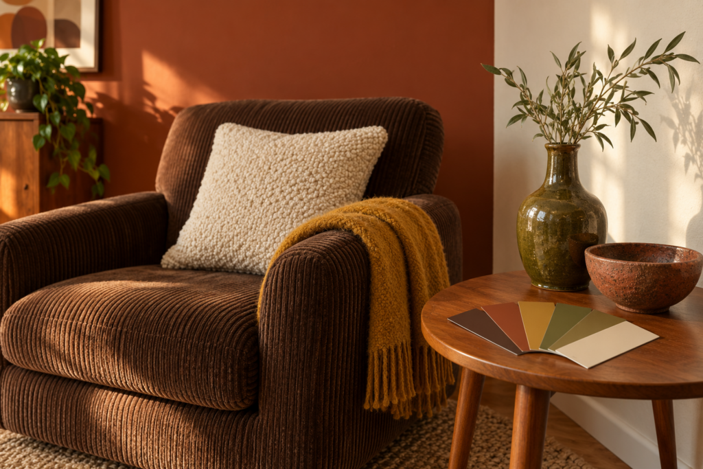
The seventies palette runs on warm earth tones with one or two saturated accents on top. The core is chocolate brown, rust, burnt orange, mustard, olive and cream. Accents come from avocado green, harvest gold, deep teal and, in the glossier version of the style, plum and burgundy. Cool grey has no place in it whatsoever.
The failure mode is obvious once you have seen it happen: too many of these colours at once, all at the same mid-tone, and the room turns into a beige-brown soup with no structure. The fix is proportion and contrast rather than restraint.
Pick five colours and assign them roles. One dominant, covering walls and the largest furniture. One secondary, covering the second-largest area, usually a rug or a sofa. Two accents, repeated at least three times each around the room. One near-neutral, usually cream, oatmeal or natural wood tone, doing the job of giving the eye somewhere quiet to land. Having proportions at all matters more than the exact ratio.
Then build in tonal range deliberately. A room of rust, mustard, olive and brown all at the same value will look flat no matter how good the individual pieces are. You need something genuinely dark, which might be a chocolate brown wall, a dark walnut cabinet or a black metal frame, and something genuinely light, which might be a cream rug, an off-white wall or a pale ceramic. Photograph the room on your phone and convert the image to black and white. If everything reads as the same grey, that is your problem.
Wall colour has more range than the decade’s reputation implies. Full seventies commitment means a saturated wall, and a deep olive, terracotta or warm ochre will make wood furniture and brass look considerably better than white ever does. The more wearable version is a warm off-white or a soft oat tone with a yellow undertone, which lets you push the colour into textiles, rugs and pottery instead. Whatever you choose, keep the undertone warm. A cool grey-white against a teak sideboard makes the wood look dull and slightly purple, and no amount of styling recovers from it.
Wood tone counts as a colour in its own right and is usually the largest one in the room. Teak runs honey-brown with an orange cast. Walnut is darker and cooler. Pine, which was everywhere in the decade, is pale and yellow. Cork reads as a warm mid-tan. Mixing two of these is authentic and good, since nobody furnished a house in one purchase. Four or five different wood tones with no repetition starts to look like a warehouse floor. Repeat each at least twice.
How do you do 70s decor without the room feeling dark and heavy?
Keep the walls and ceiling light, and put the depth into furniture and textiles instead. A dark brown sofa in a cream room reads as rich. The same sofa in a brown room with brown carpet reads as a cave. The colours themselves are not the problem, the distribution is.
Three other habits help considerably. Choose furniture with visible legs or an open base for at least half the pieces, since low solid-sided seating in quantity makes a room feel weighed down. Use reflective material deliberately, meaning chrome, smoked glass, a mirror or brass, which bounces light around and is entirely period-correct. And light at three heights with warm bulbs on dimmers, because a dense earthy room under a single cold overhead fixture will always look gloomy no matter what is in it.
Furniture Shapes, Curves and the Materials That Carry the Style
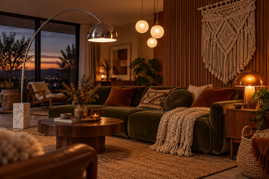
Seventies furniture is defined by three things: low height, generous curves and modularity. Seats sit lower and deeper than contemporary furniture, arms and backs are rounded and thick, and seating frequently came as sections that could be rearranged rather than as a single fixed sofa.
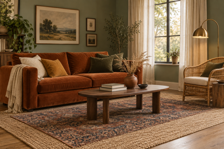
The modular sofa is the decade’s signature piece and the one most worth hunting for. Original modular systems came as armless units, corner units and chaise sections that clip or sit together, upholstered in corduroy, velvet, boucle or wool in a solid earth tone. They are deep enough to lie down on, they suit open-plan spaces, and a curved or L-shaped arrangement instantly defines a seating area in a room with no natural anchor.
Beyond that, the recognisable archetypes are worth knowing by shape rather than by name:
- Deep-buttoned or channel-tufted lounge chairs in leather or velvet, low-backed and wide
- Rattan and cane seating, including the fan-backed peacock chair, barrel chairs and hanging egg chairs
- Bentwood and tubular chrome frames with leather or canvas slings
- Round or oval smoked glass tables on chrome or travertine bases
- Low sideboards and wall units in teak, rosewood or pine, often with sliding doors
- Bean bags, floor cushions and low ottomans, which were genuinely how people sat
- Waterfall-edge and plinth-based pieces with no visible legs at all
Material choice is where the style becomes unmistakable. The decade’s palette of materials included teak and rosewood, pine, rattan, cane and bamboo, cork on both walls and floors, chrome and tubular steel, smoked and coloured glass, travertine and onyx, moulded plastic in bright saturated colours, corduroy, velvet, boucle and wool, and a great deal of leather in tan and cognac.
Texture contrast is what keeps the look from feeling like a period set. A smooth chrome frame beside a nubby boucle cushion beside rough rattan beside a deep shag pile gives a room depth without a single pattern involved. Original interiors relied on this heavily, because the forms themselves are simple.
A few practical proportions, since low furniture changes the maths of a room:
- Keep the coffee table height within a few centimetres of the seat height. A standard-height table in front of a low sofa looks wrong immediately.
- Leave 40 to 45cm (16 to 18 inches) between the sofa edge and the coffee table.
- A rug should sit under at least the front legs of every seating piece, and with low modular seating, ideally the whole arrangement sits on it.
- Low seating suits rooms with standard or low ceilings particularly well, because the eye travels above the furniture rather than being blocked by it.
If you are buying new rather than vintage, check the seat height and depth before the styling. A great deal of furniture sold as seventies-inspired has the curved arms and the corduroy but sits at modern height and depth, which is a different piece of furniture wearing the right fabric.
Lighting, Pattern and Texture: Where the Decade’s Personality Lives
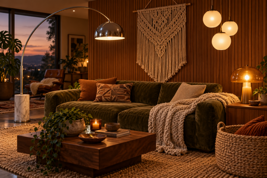
Lighting in the seventies was treated as sculpture, and it is the fastest, cheapest way to move a room toward the style. A single strong fixture will do more than a sofa.
The forms to look for are the chrome arc floor lamp with a heavy marble or steel base curving over a seating area, the mushroom table lamp with a domed glass or metal shade, the rise-and-fall pendant that pulls down over a dining table, the multi-globe chandelier with frosted glass spheres on chrome arms, smoked glass pendants, and rattan or wicker shades that throw patterned shadows across a wall. Finishes run to chrome, brass, smoked glass, white enamel and natural fibre. Brushed nickel and matte black belong to later decades and will read as wrong.
Layer at three heights as a matter of course. An overhead fixture, table lamps at roughly seated eye level, and something low, whether a floor lamp or an uplighter. Use warm bulbs throughout, around 2700K, and dim everything you can. Seventies rooms are at their best after dark, and cold light flattens every texture the style depends on.
Pattern is where restraint pays. The period repeats are large-scale geometrics, op-art repeats, abstract florals with thick outlines, paisley, and the wide swirling shapes that read as instantly seventies. All of them work, and all of them are strong enough that one is usually enough in a room. Put it on a single surface, whether one wall, a pair of curtains, a rug or a set of cushions, and keep everything else solid and textural. Full-wall pattern plus patterned curtains plus a patterned carpet is precisely how the decade earned its reputation.
Texture carries the rest, and this is the part people underestimate. The seventies textile vocabulary includes shag and high-pile rugs, corduroy and wide-wale velvet, wool boucle, macramé, woven wall hangings, chunky knit throws, jute and sisal, and rough natural linen. Stack three or four of these in one room and it will feel like the decade even if the colours are restrained and the furniture is contemporary.
Wall treatments deserve their own mention because they were a defining feature. Vertical timber slat panelling in a warm wood is the single most effective period-correct wall treatment and works beautifully in a modern house. Cork panelling is warm, sound-absorbing and genuinely useful in a home office. A macramé or woven wall hanging fills the awkward wall space above a sofa better than most art. And a single wall of large-scale geometric wallpaper, with the other three left plain, gives you the full drama at a fraction of the visual cost.
Plants are not an accessory in this style, they are structural. The decade put greenery everywhere, and the specific plants matter: spider plants and string of pearls in macramé hangers, trailing pothos on high shelves, rubber plants and monstera in floor pots, a dramatic cheese plant in a corner, ferns in hanging baskets. Put them in terracotta, glazed stoneware or woven baskets, and use a tall tapered plant stand, which is itself one of the most recognisable small pieces of the period.
Room by Room: Where 70s Style Works Best and Where to Hold Back
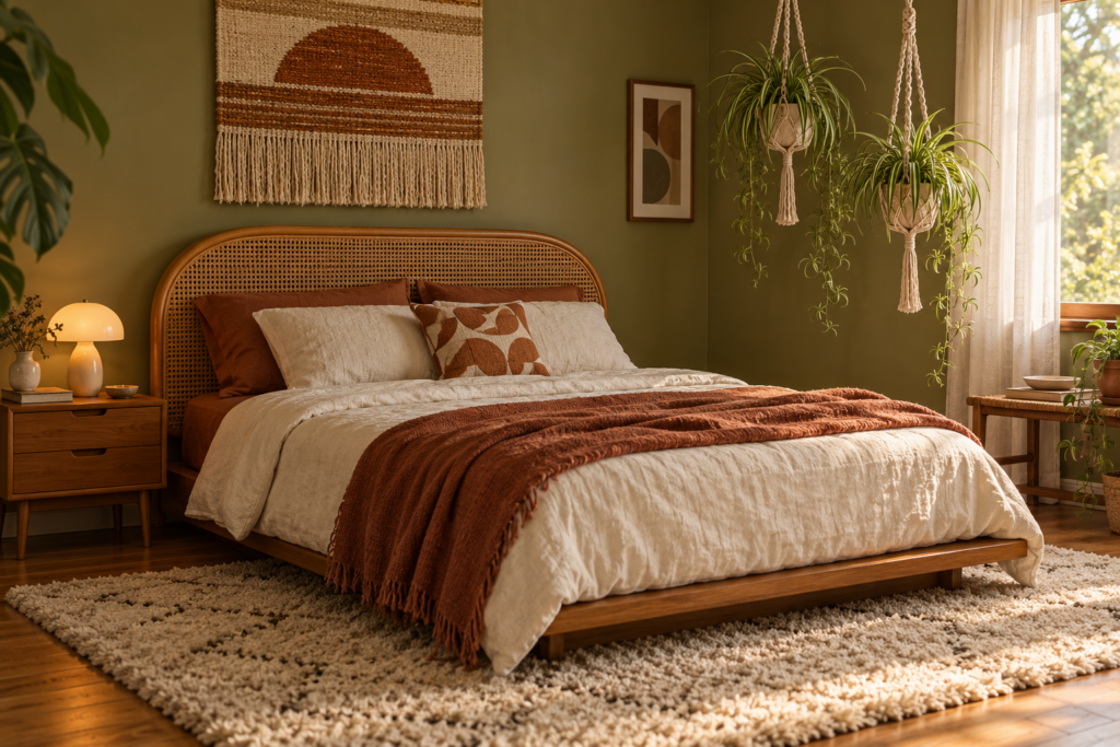
Some rooms take this style easily and some fight it, and knowing which is which saves both money and regret.
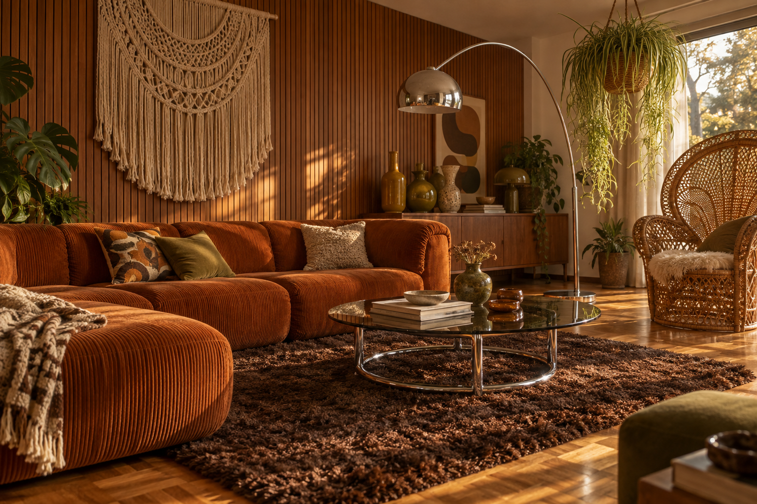
Living rooms are the natural home. Low modular seating, a shag or high-pile rug, a slat wood accent wall, an arc lamp, hanging plants and a smoked glass table give you a complete scheme without anything unusual. This is also the room where the conversation-pit instinct translates well into modern open-plan spaces, since a low sectional arrangement defines a seating zone in a large room far better than a standard sofa against a wall.
Bedrooms suit the earthy, crafty strand particularly well. A low platform bed, a cane or rattan headboard, warm terracotta or olive walls, a woven wall hanging, macramé plant hangers and a shaggy rug underfoot make a room that feels calm rather than costumed. Keep pattern to one element, usually the bedding or a single curtain fabric.
Home offices and studies are quietly the best fit of all. Cork panelling on one wall is genuinely functional, absorbing sound and taking pins. A teak desk with a chrome task lamp, a leather and chrome desk chair, and a wall of plants makes a working room that is warm rather than clinical.
Kitchens and bathrooms are where caution earns its keep. Permanent fixed elements are expensive to undo and are exactly where the decade’s dated reputation lives. Avocado and harvest gold sanitaryware, full-wall patterned tile and wood-effect laminate panelling are the specific things to leave in the past. The safe version puts the period character into removable and refinishable elements: warm wood or cane cabinet fronts, brass or chrome hardware, a terracotta or ochre tile in a simple format, open shelving with studio pottery, a patterned runner, and warm-toned paint. All of that reads as seventies and all of it can be changed in a weekend when you tire of it.
Hallways and small rooms take the style surprisingly well because they are too small to be anything other than a moment. A deep terracotta hallway with a slat wood wall, a runner and a period pendant is more memorable than most whole houses.
Can you do 70s style in a rental without making permanent changes?
Almost all of it is achievable without touching the fabric of the building. The style lives in furniture, textiles and lighting far more than in fixed surfaces, which makes it unusually rental-friendly.
Peel-and-stick slat panelling and removable wallpaper both exist and come off cleanly from sound, well-prepared walls. Large rugs cover most of a beige carpet. Plug-in wall sconces and floor lamps supply the lighting layers without an electrician. Freestanding rattan and teak storage does the work of built-ins and travels with you. Hanging planters mount on tension rods, ceiling hooks in existing fittings, or simply sit on high shelves with trailing foliage doing the same job. And curtains hung high and wide on a tension or pressure rod change the proportions of a window without a single drill hole.
The one thing worth prioritising if the budget is tight: a good vintage light fixture and a decent high-pile rug. Those two together will move a plain rental room further than any amount of accessorising.
Sourcing Genuine Vintage Pieces and Spotting Reproductions
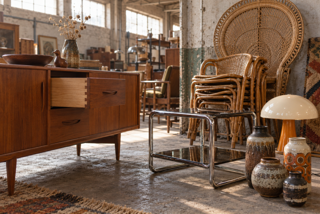
Seventies furniture is still the best value of any mid-century-adjacent period, because collectors chased the fifties and sixties first and the seventies market is only now catching up. Solid teak, chrome and good vintage rattan at secondhand prices will outlast most new furniture by decades.
Where to look, roughly in order of value for effort:
Estate sales and house clearances produce the best material, because whole households appear at once and the pieces nobody photographed well go cheaply. Houses that have not changed hands since the seventies are the jackpot, and they surface more often than you would expect.
Regional auction houses sell mixed lots of pottery, lamps, glass and small furniture for very little, since the market for brown furniture generally remains soft. Box lots in a general sale frequently cost less than a single new cushion.
Local classified listings and marketplace apps reward searching the words sellers actually use rather than dealer terminology. Search for retro, teak, vintage, rattan, cane, chrome, smoked glass, modular and the decade itself, and search common misspellings too. Sellers clearing a relative’s house often price by bulk rather than by piece.
Charity shops and clearance warehouses turn stock over constantly, so frequency beats strategy. Ten minutes weekly finds more than two hours monthly. Studio pottery, glassware, lamps and frames are the consistent wins.
Architectural salvage yards supply slat panelling, period doors, coloured glass and light fittings.
When you have a piece in front of you, the checks are quick. Look underneath for a maker’s stamp, brand or paper label, usually on a drawer base, a back panel or the underside of a seat. Check drawer construction, since dovetails and proper joinery indicate a piece worth restoring while staples and glued butt joints do not. Establish whether wood is solid or veneered by looking at the edges and the underside, remembering that good veneer over a solid core is period-correct and fine, while veneer over chipboard is not. Check chrome for pitting, which is difficult and expensive to reverse, and check cane and rattan for cracked or broken strands, which are repairable but fiddly.
Condition problems split cleanly into two categories. Surface issues, meaning dry wood, water rings, scratches, tired upholstery and dusty fabric, are all fixable and are your best negotiating leverage. Structural issues, meaning wobbling joints, warped panels, delaminating veneer, perished foam and active woodworm, cost real money and are rarely worth it unless the piece is exceptional.
Restoration is simpler than it looks for most of this era. Teak and rosewood revive dramatically with a thorough clean and two thin coats of teak oil, wiping away the excess each time. Chrome responds to a gentle metal polish and fine steel wool used with care. Rattan and cane want a wipe rather than a soak, since too much water loosens the weave. Reupholstery is the expensive one, so price it, including the fabric, before committing to a chair that needs it. A large modular sofa in period fabric that is merely dirty rather than damaged is often worth a professional clean instead.
Are reproductions worth buying, or should you hold out for originals?
It depends entirely on the piece. Buy vintage where age is an asset, meaning wood storage, tables, chrome frames, lighting, rattan, glass and pottery, all of which look better with a patina and were built to a standard that costs a fortune to replicate now.
Buy new where age is a liability. Foam degrades, so a forty-year-old sofa may need full refoaming. Mattresses, obviously. Electrical items need checking and often rewiring, which is worth doing on a good lamp and not worth doing on a mediocre one. Original shag rugs are frequently beyond saving, and modern high-pile versions are easier to clean.
For the sculptural statement pieces, the honest position is that a good original beats a cheap copy every time, and a licensed reproduction built to the original specification beats an unlicensed one built to a price. The difference is almost never the shape, which copies get right. It is the material thickness, the foam density, the joinery and the finish, all of which announce themselves within a couple of years.
Frequently Asked Questions
Is 70s decor coming back in style?
It has been building steadily for several years and is now firmly in the mainstream, particularly the earthy, craft-led strand with rattan, macramé, terracotta and curved low seating. The reason it has staying power is that it solves a problem the previous decade of grey minimalism created. People wanted warmth, texture and personality back, and the seventies is the most complete source of all three. The glossier chrome and smoked glass version is following behind it and is still comparatively cheap to buy secondhand.
What colours are most associated with 1970s interiors?
Chocolate brown, burnt orange, harvest gold, mustard, avocado green, rust and cream form the core. Deeper variants appear in the more glamorous version of the style, particularly plum, burgundy and dark teal. What unites all of them is warmth. Every colour in the period palette has a yellow or red undertone, which is why cool greys and blue-toned whites look so obviously wrong alongside them.
How do I get the 70s look without it feeling like a theme party?
Mix eras deliberately. A room furnished entirely from one decade always reads as a set, regardless of which decade it is. Keep contemporary pieces in the mix, particularly plain upholstery and simple tables, and let three or four genuinely period items carry the character: a light fixture, a piece of rattan or teak, a high-pile rug and some studio pottery. Also skip the most costume-like signifiers, meaning full-wall busy pattern, matched furniture suites and anything in avocado that is plumbed in.
What flooring works best for 70s-inspired rooms?
Warm mid-toned wood is the safest and most versatile choice, and parquet in particular is strongly period-correct and increasingly available again. Cork is authentic, warm underfoot and quiet. Terracotta tile suits kitchens and hallways. Layer a high-pile or shag rug on top of whichever you choose, since the softness underfoot is a genuine part of the style. Avoid grey-washed and very pale timber, which fights the entire warm palette.
Can 70s style work in a small apartment?
Yes, though the emphasis shifts. Low furniture is an advantage in rooms with standard ceilings because it keeps sightlines open above it. Choose one or two pieces with open bases or visible legs so the room does not feel weighed down, keep walls and ceiling light, and concentrate the pattern on a single surface. Mirrors and chrome are period-correct and genuinely useful for bouncing light around. What to avoid is filling a small room with deep solid-sided seating and dark walls at the same time.
How do I clean and care for vintage rattan, cane and shag rugs?
Rattan and cane want dusting with a soft brush and an occasional wipe with a barely damp cloth, never a soak, since water loosens the weave and can cause sagging. Keep them out of direct sun and away from radiators, because both dry the fibres and cause cracking. High-pile and shag rugs need vacuuming without a beater bar, ideally with a suction-only setting, and shaking out when possible. Rotate them a couple of times a year so wear spreads evenly.
Where should I start if I like the look but do not know where to begin?
Start with lighting and a rug, because together they change a room more than furniture does and they cost less. Find one sculptural vintage fixture, whether an arc lamp, a mushroom table lamp or a rise-and-fall pendant, and add a high-pile rug in a warm earth tone. Then add plants in woven or terracotta pots. Those three moves establish the style in a room of otherwise plain furniture, and they tell you fairly quickly whether you want to commit further.